If you want to delve deeper, there's a more in-depth portfolio of "stuff wot I've done" a bit further down the page.
here's a quick-ish 23-image highlights carousel.
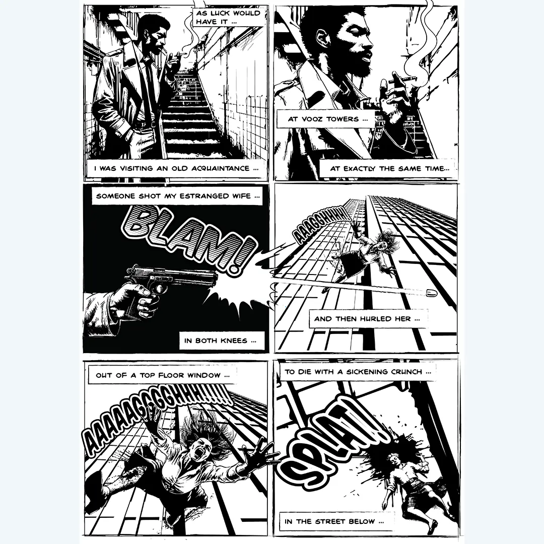
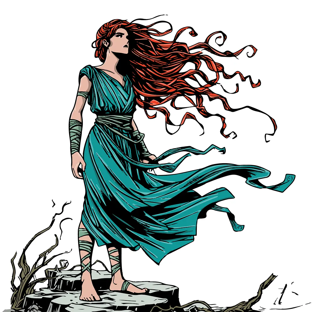
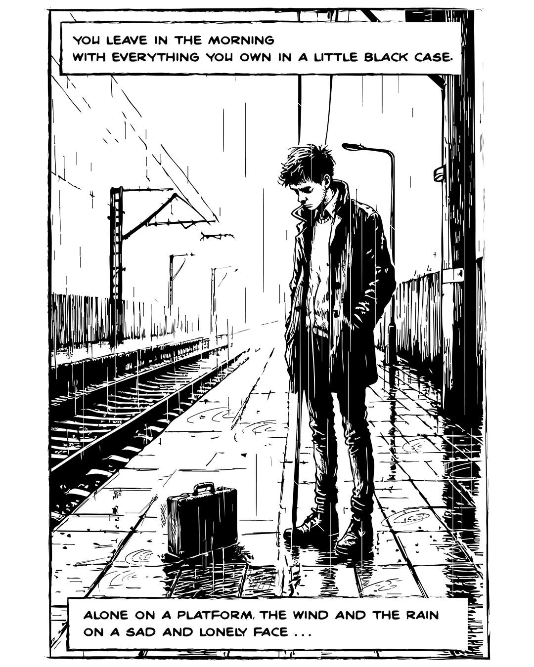
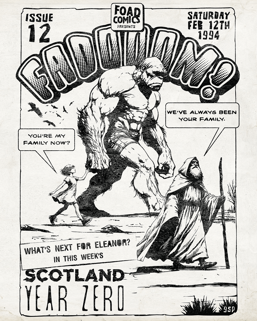
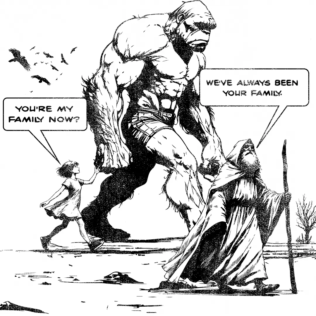
A recreated panel from the FADOOOM! comic strip "Scotland Year Zero" Pen and ink in Adobe Illustrator.
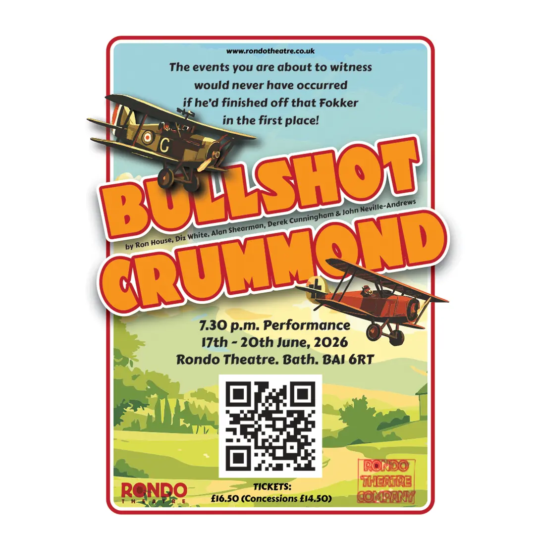
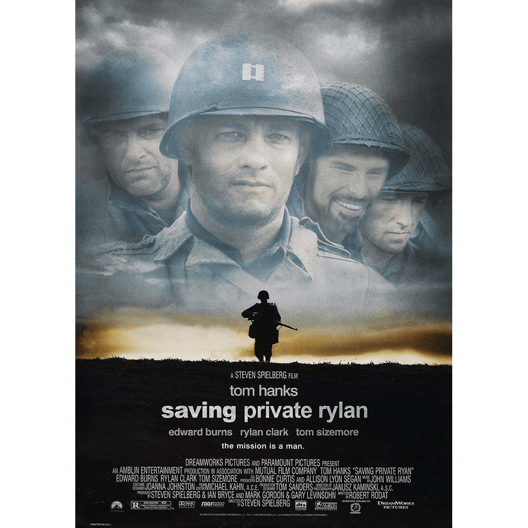
Having been a huge fan of the film since 1983, it took me until 2026 to finally see the stage show (twice in two days!) The play's director asked me to design the poster 🙂
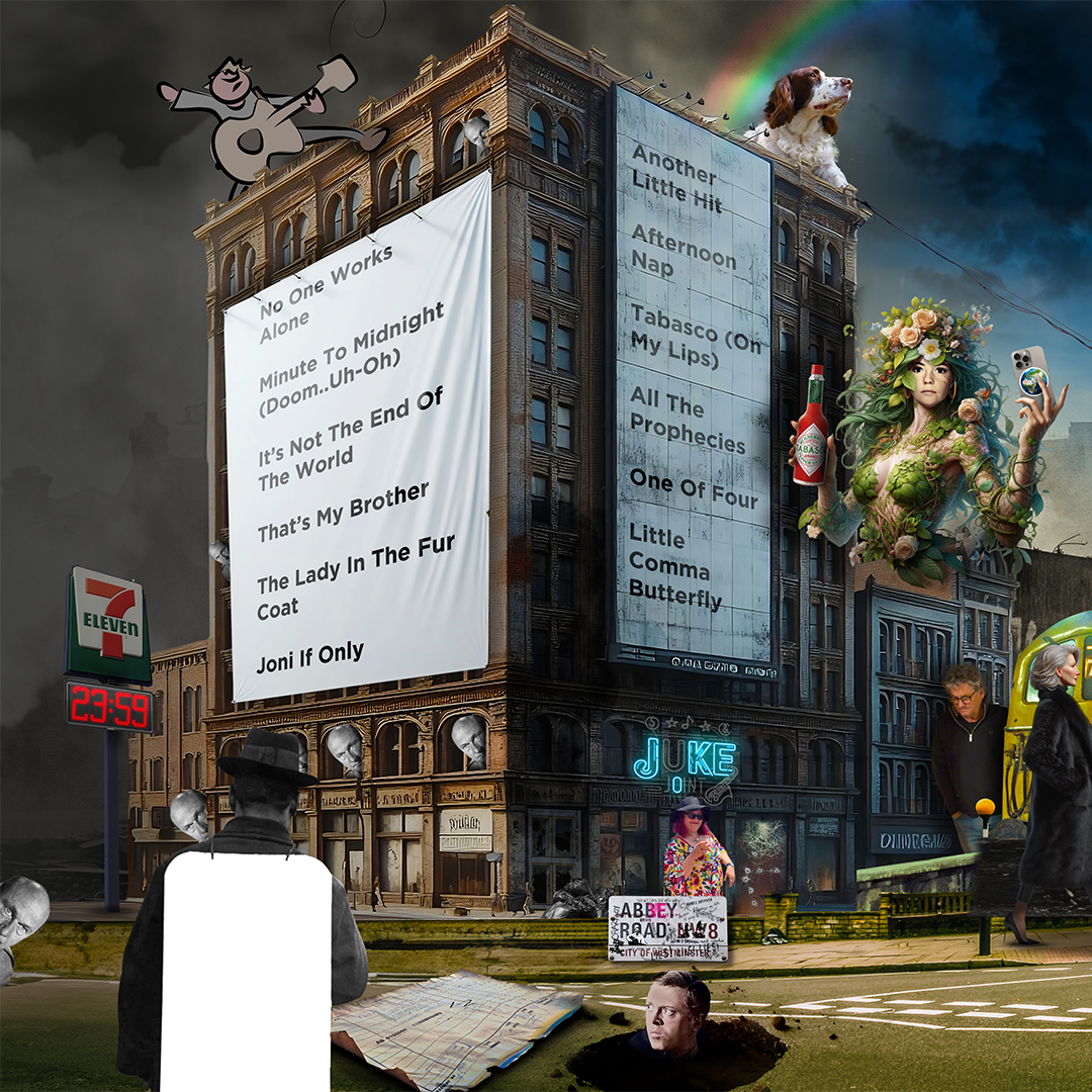
The front cover artwork for Nick Harper's last album, 58 Fordwych Road. Photoshop composite. AI used to add some of the extra background stuff that wasn't on the original photo.
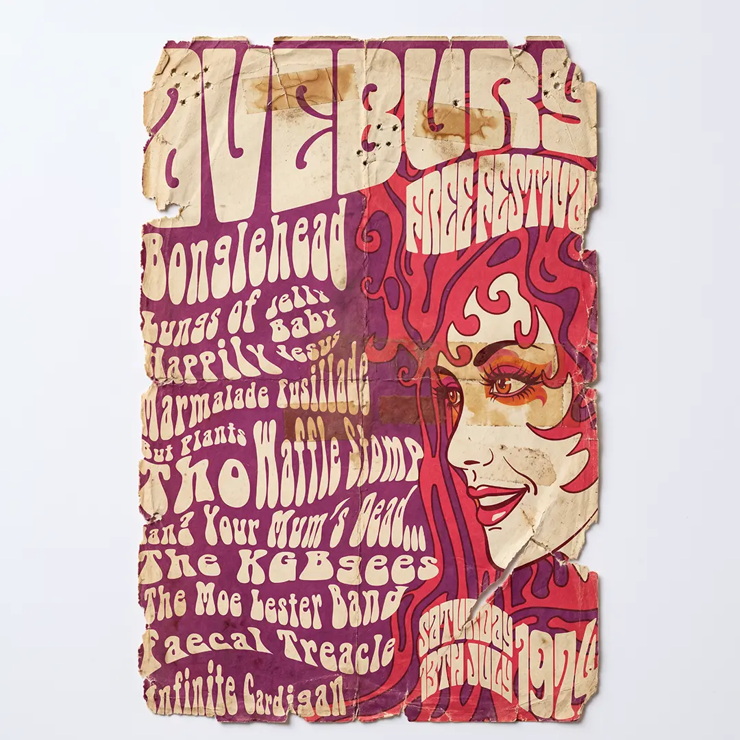
A spoof poster/t-shirt design for a made-up festival in 1974, featuring a bunch of made-up band names. If it looks familiar, it's because it's on the home page 🙂
The Cephid alter ego was created by musician and composer Moray Macdonald as an opportunity to bring his diverse influences together into a single coherent artistic statement. I was fortunate enough to be asked to create his album artwork and various bits of promotional material, including a t-shirt design.
The Devizes Daphne Oram Festival Logo, celebrating 100 years of Daphne Oram and women in electronic music. Sadly unused, as the funding bid failed! Boo!
Logo design for Aura Beauty Studio.
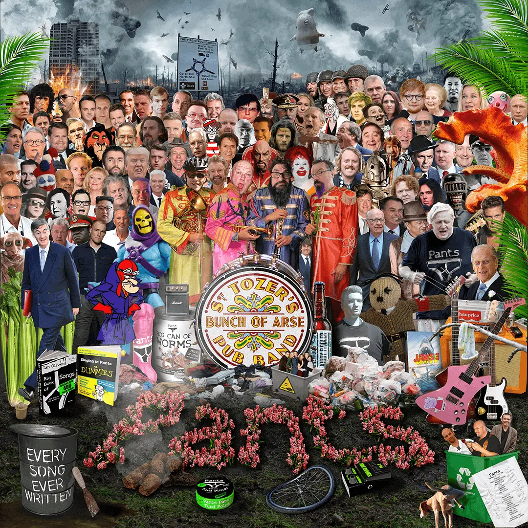
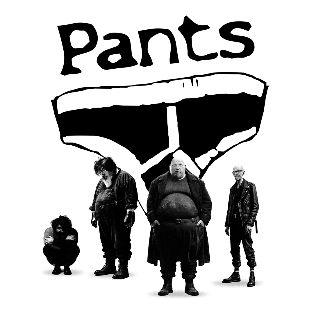
Complex Photoshop composite of a spoof version of the Sergeant Pepper cover, designed for the band Pants. It features all manner of distasteful and questionable people such as Boris Johnson, Donald Trump, Kanye West, Laurence Fox, Priti Patel and Duran Duran. No Ai used at all.
Logo design for the Rena's Promise website. If you've never read Rena Kornreich Gelissen's Auschwitz memoir, I'd thoroughly recommend it.
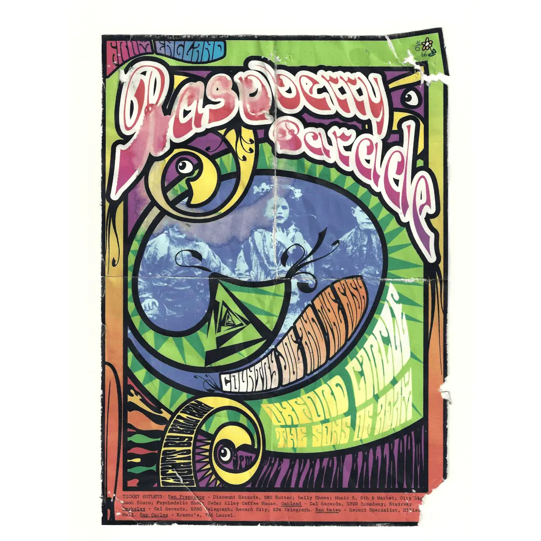
Following the rediscovery of their long-lost album Time Is Honey, and its subsequent remastering and release at the hands of Steve Marshall, I was asked to design a Raspberry Parade poster (no originals seemed to exist anywhere) Given that the album dates from 1969, it seemed like a good idea to age the poster some, and rather than spend ages doing that in pre-AI Photoshop, I printed it out, manually aged it and scanned the resulting wreck 🙂
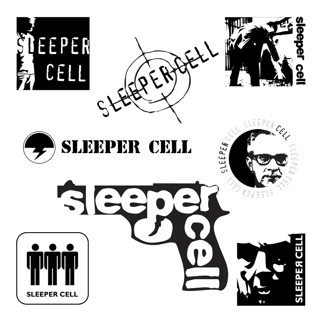
Nick Harper's Sleeper Cell was a short-lived, one tour band consisting of Nick, New Model Army's Moose Harris and The Lurkers' Dan Tozer. They needed a logo. This is the logo sheet. I forget now which one he chose!
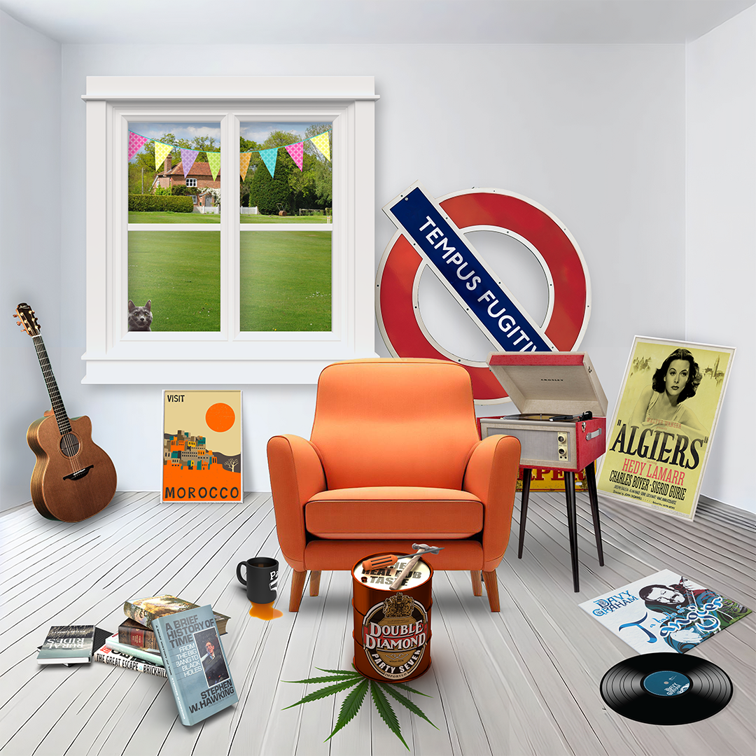
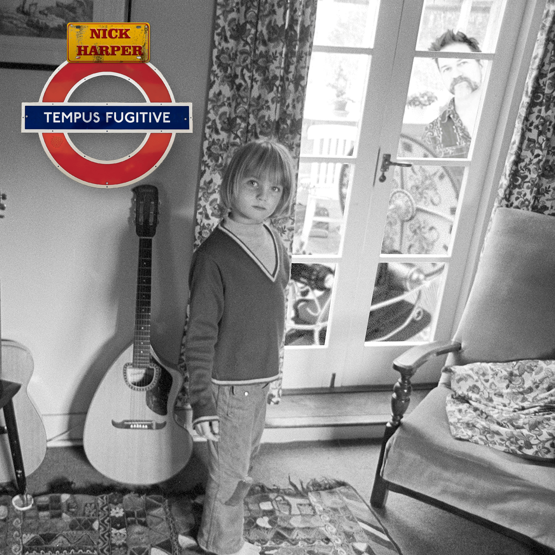
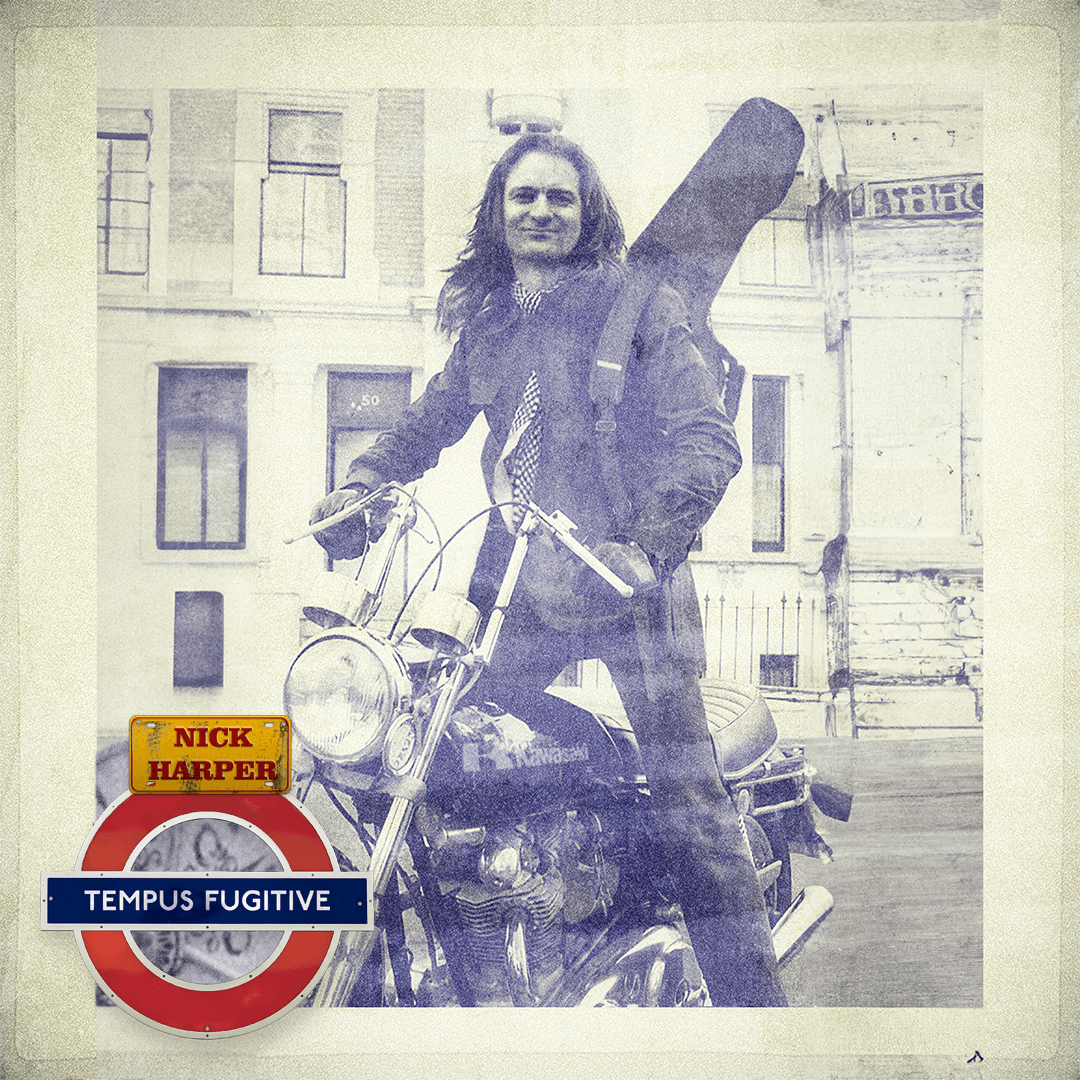
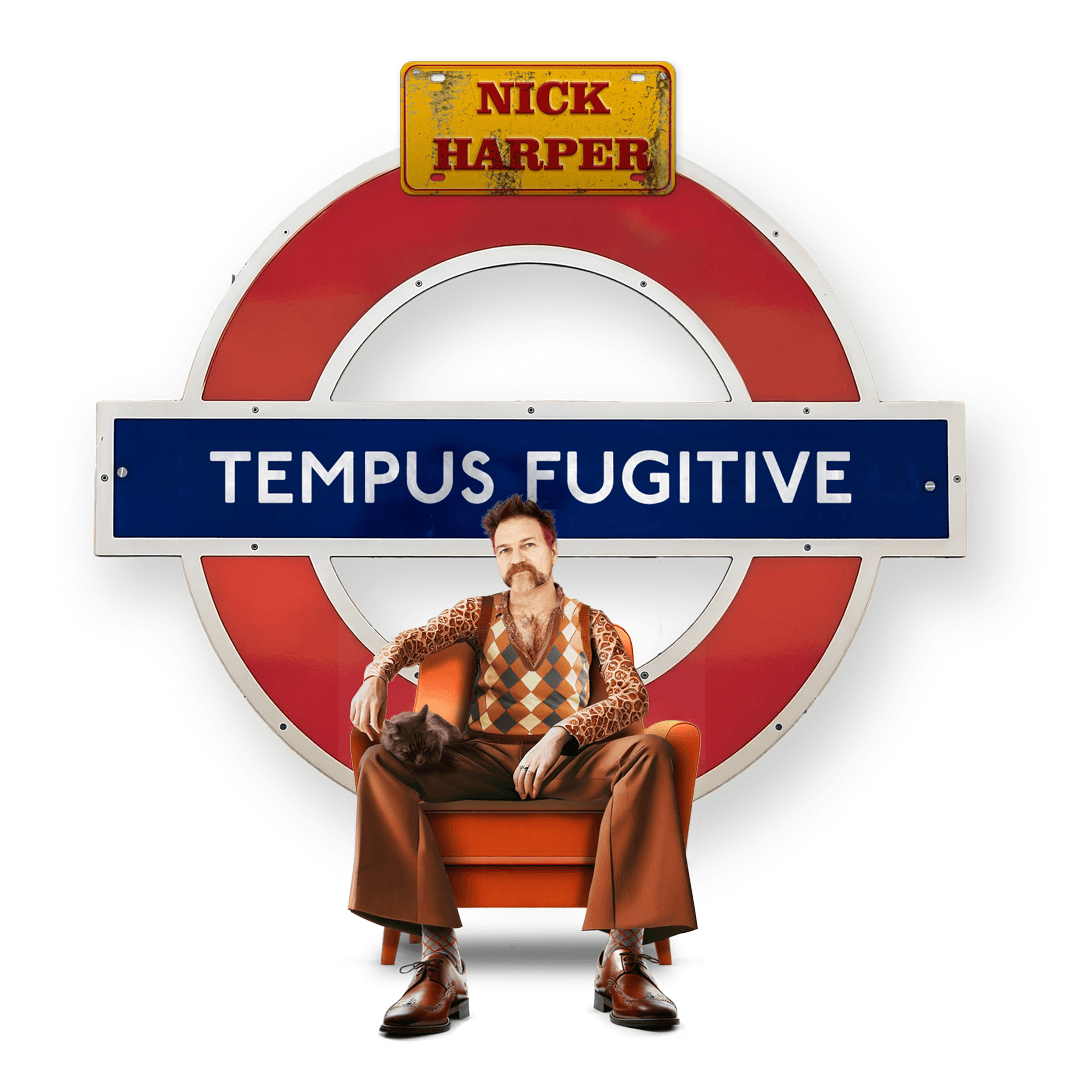
Nick Harper : Tempus Fugitive : 2023
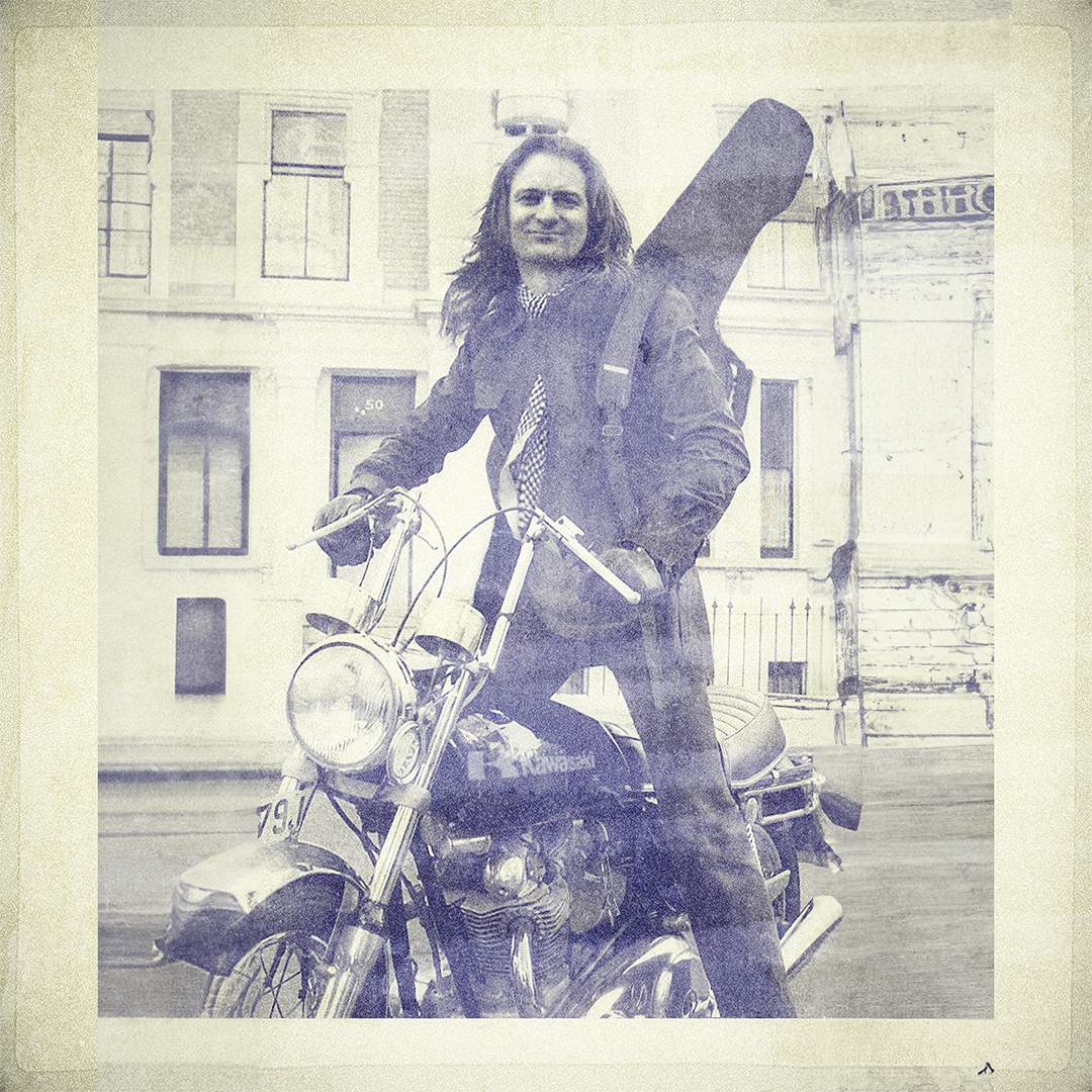
I admit to using AI on this one. Nick's legs and shoes were the products of Bing's image creator, although the socks in between came from some random guy's open Flickr account 🙂 His stylish shirt and tank-top came from two other photos and I think his huge moustache was a product of the FaceApp app on my phone. His hairy chest was courtesy of a Photoshop brush. Everything else is either a composite or a cut-out. There's some 3D modelling work in this too, but only some real basic stuff.
Following the completion of the neo-neolithic longbarrow at All Cannings in Wiltshire, I was asked to design a fold-out brochure for it.
Eurydice : One of the pen and ink characters I drew in Adobe Illustrator for the Chris Schuman musical Zeus on the Loose.
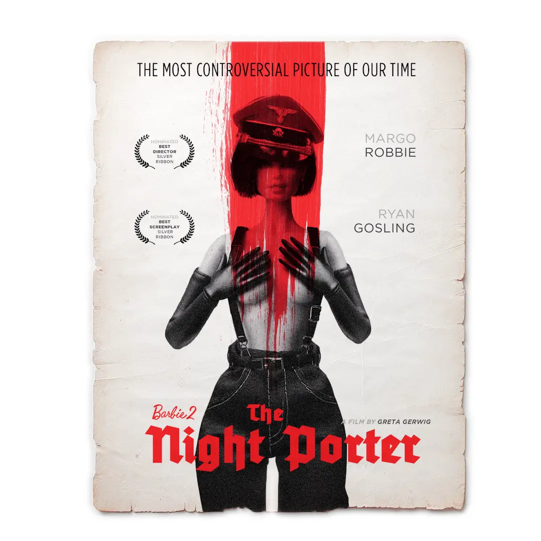
For some reason I recreated that iconic photo of Charlotte Rampling using a Barbie Doll... which then prompted the idea for a film idea: A reworking of The Night Porter as the second Barbie film.
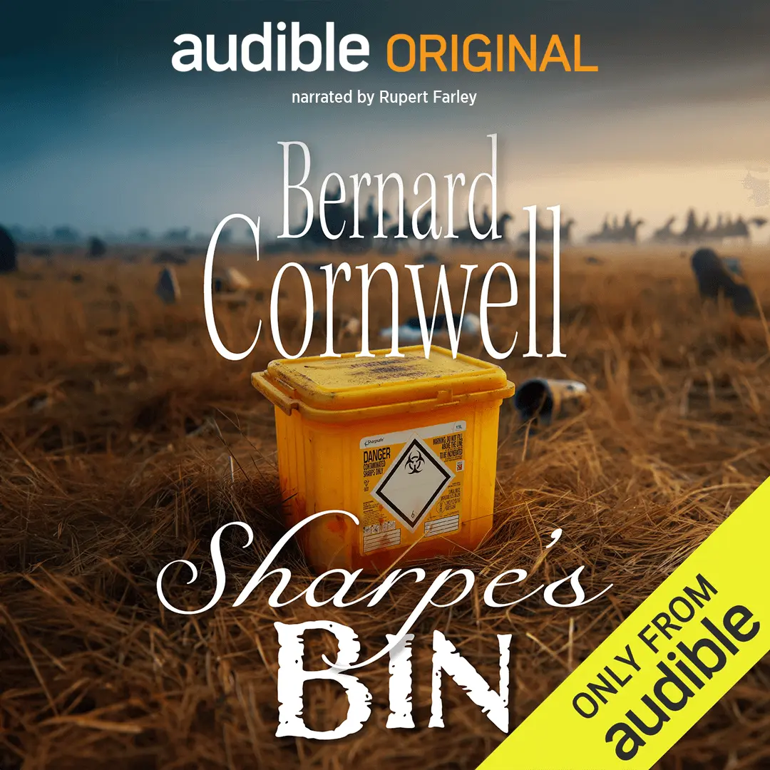
My mum's an ex-nurse. She got the joke! Spoof Audible advert for Bernard Cornwell's novel Sharpe's Bin, featuring a yellow hospital sharps bin...and...well, yeah. Another shit joke. Again, I don't know why I did this...
I have no recollection of this company or this project. I just found it in an old archive from years ago and thought it looked good. Probably designed in Xara.
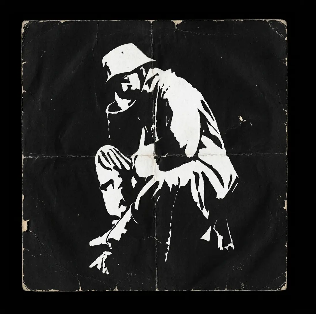
Proper old-school Pen and ink drawing of a despondent German soldier at the end of World War 1. Drawn sometime around 1995.
"Can you draw our band for us, mate?" Why, yes. Yes I can. And I can design a simple, text-based logo to go with it too!
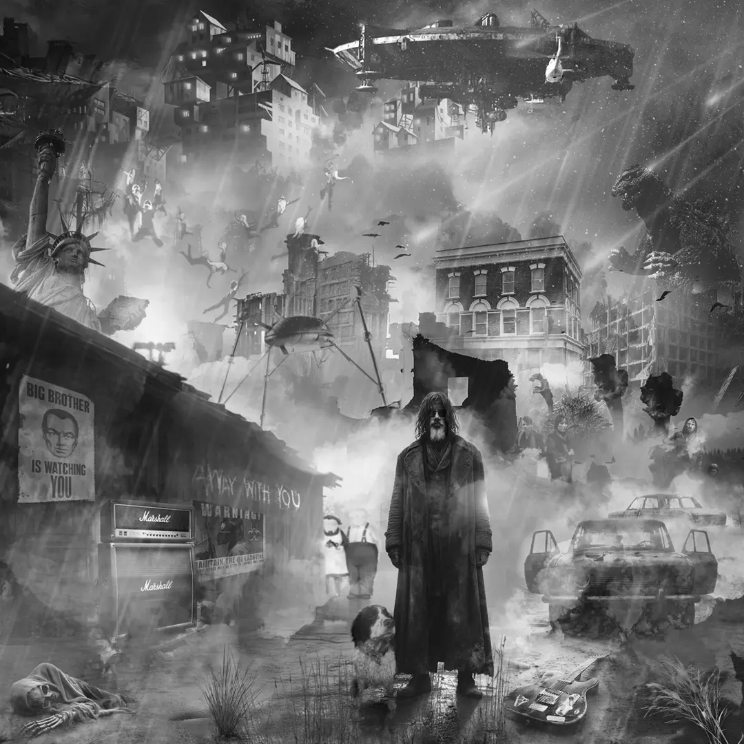
Again, I have no idea why I did this. What started out as a post-apocalypic representation of me, my old dog Farley and my Telecaster slowly ballooned into this post-apocalyptic nightmare landscape, featuring many nods to many post-apocalyptic/horror/sci-fi films, tv series, games and novels: Day of the Triffids, War of the Worlds, Logan's Run, Survivors, Sean of the Dead, Godzilla, When The Wind Blows, Planet of the Apes and 1984, to same but some.
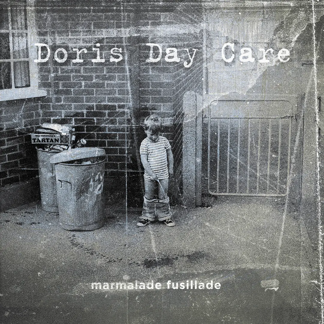
Main cover artwork for the Doris Day Care album Marmalade Fusillade. The original photo was one I discovered whilst scanning a load of old negatives for my mum. It's not me having a big wee all over the ground, but the setting is vaguely familiar (Balham. Late 1960s) I presume the kid in question was someone I used to hang out with. Anyway. It fitted the brief!
The first album cover I designed for Nick Harper way back in 2004! Designed using Corel Photopaint and Xara.
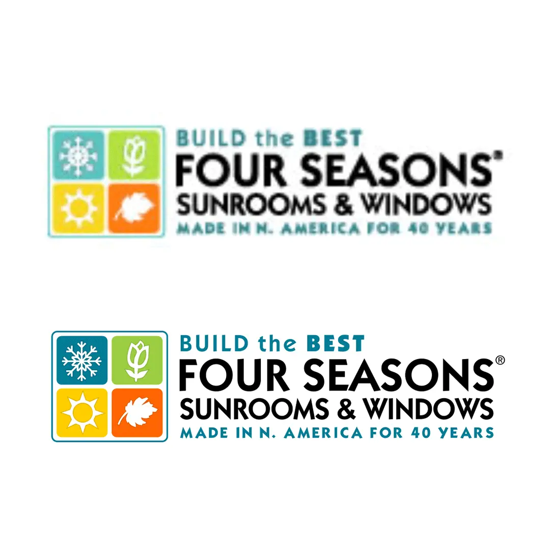
Client's only logo (top) My recreation (bottom) I've been asked to do similar reconstructions many times. What with AI being around now you can - to some extent - do this in a matter of seconds, but when the original logo is absolutely rubbish, the end results always seem somewhat under-par. Painstakingly recreating it by eye still gives the best results!
I designed this over 20 years ago, and have included it here because the company it was designed for is still using it! I guess I must have done something right 🙂
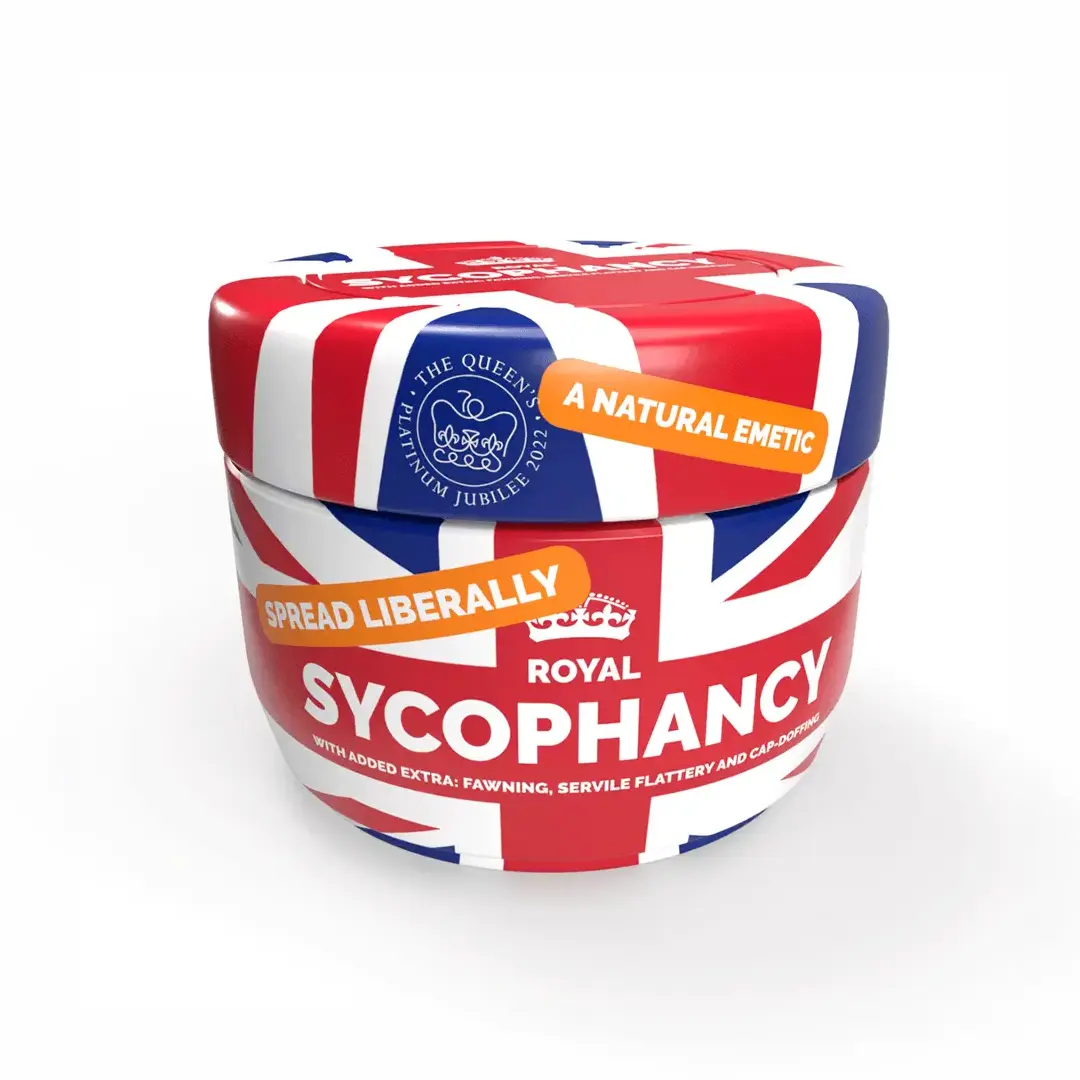
3D Adobe Dimension render. My contribution to the Queen's Platinum Jubilee celebrations. As you may have guessed from this, I'm a "citizen not a subject" kind of guy 🙂 I actually lost 4 Facebook friends over this one. Oh no!!!!
Logo design for the Pewsey Belles Ladies' Choir.
A partial portfolio of stuff wot i've done
conveniently sorted by subject into convenient sections... How convenient!
Nick Harper: “The Man Who Plays Guitar Like He’s Wearing God’s Underpants” as some music journo dubbed him many years ago. I knew him from school and used to hang around at VE band rehearsals.
It was fairly evident even then that they weren’t just “some 6th form band”. There was something a bit special about them.
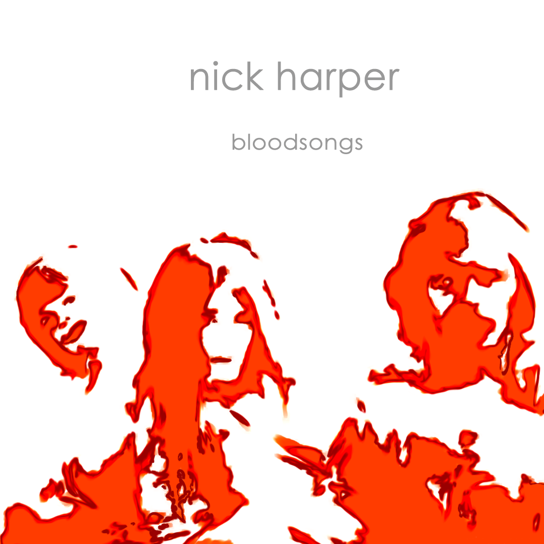
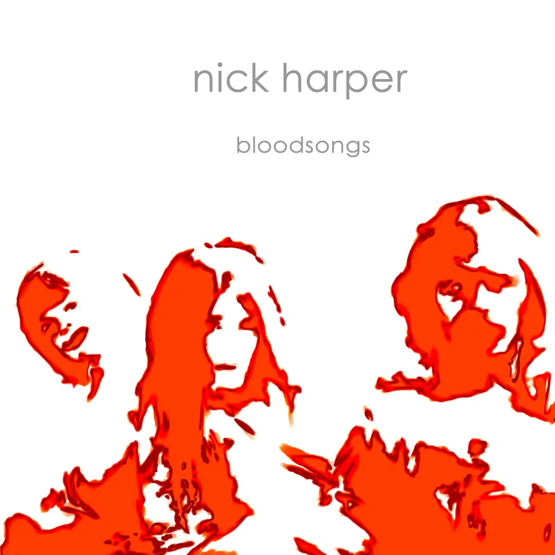
And as it happens, I was right: Nick has since carved out a very successful solo career spanning five decades, 14 studio albums and various live, compilation and single releases and, much to my joy and dismay, he asked me to do the artwork for his 2004 album Bloodsongs.
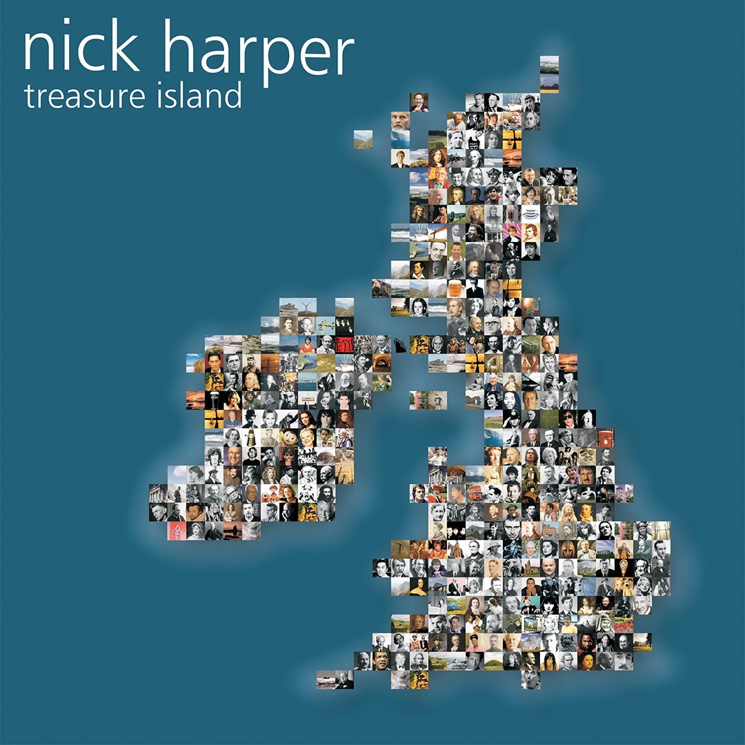
And then in 2005 he asked me to do Treasure Island.
Fast forward to 2025 and I’ve just finished all the artwork for the vinyl and CD releases of 58 Fordwych Road.
I guess I must be doing something right 🙂
Nick Harper - 58 Fordwych Road : 2025
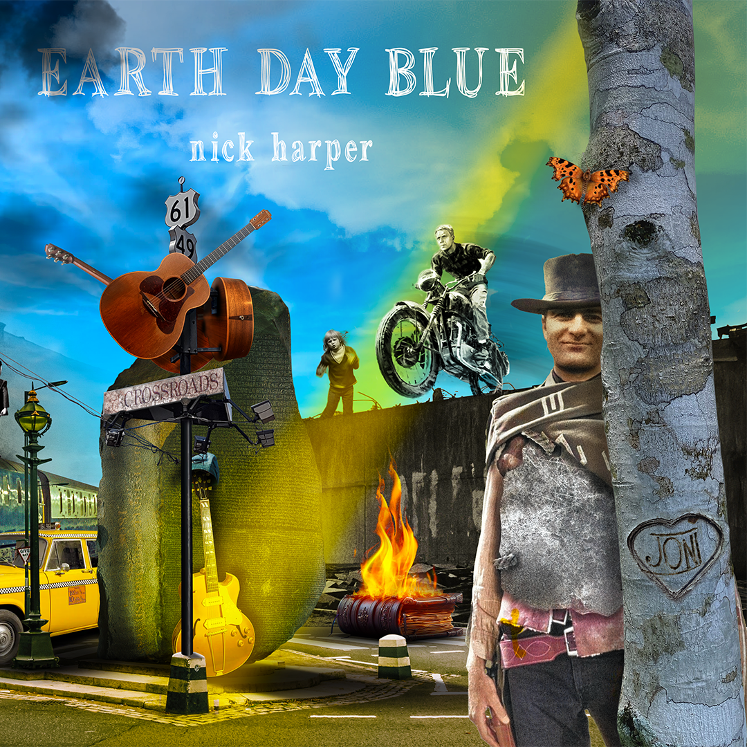
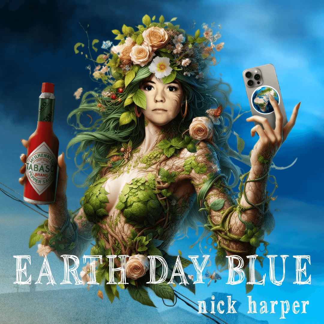
Nick Harper : Earth Day Blue : 2024 : Cover
Nick Harper : Tempus Fugitive : 2023
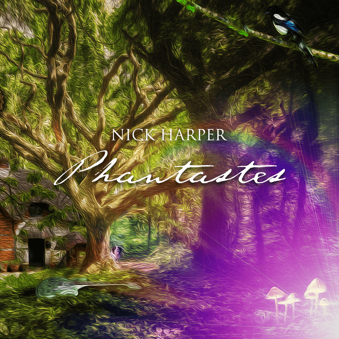
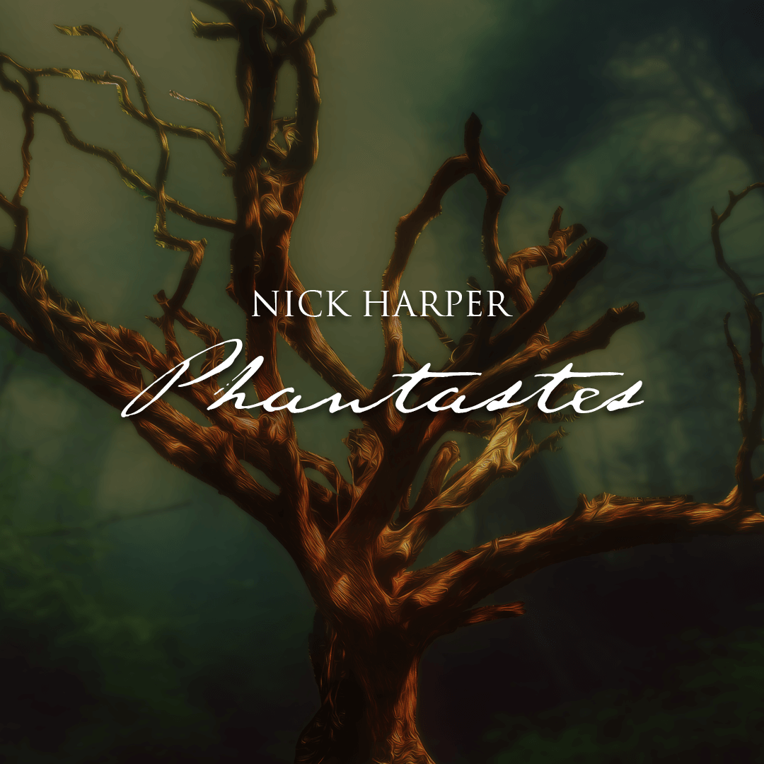
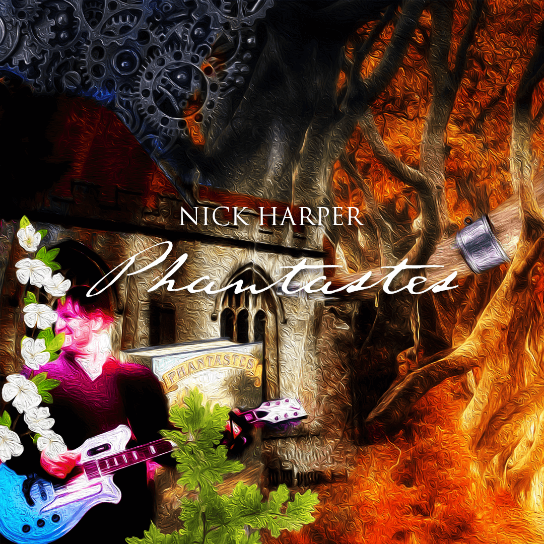
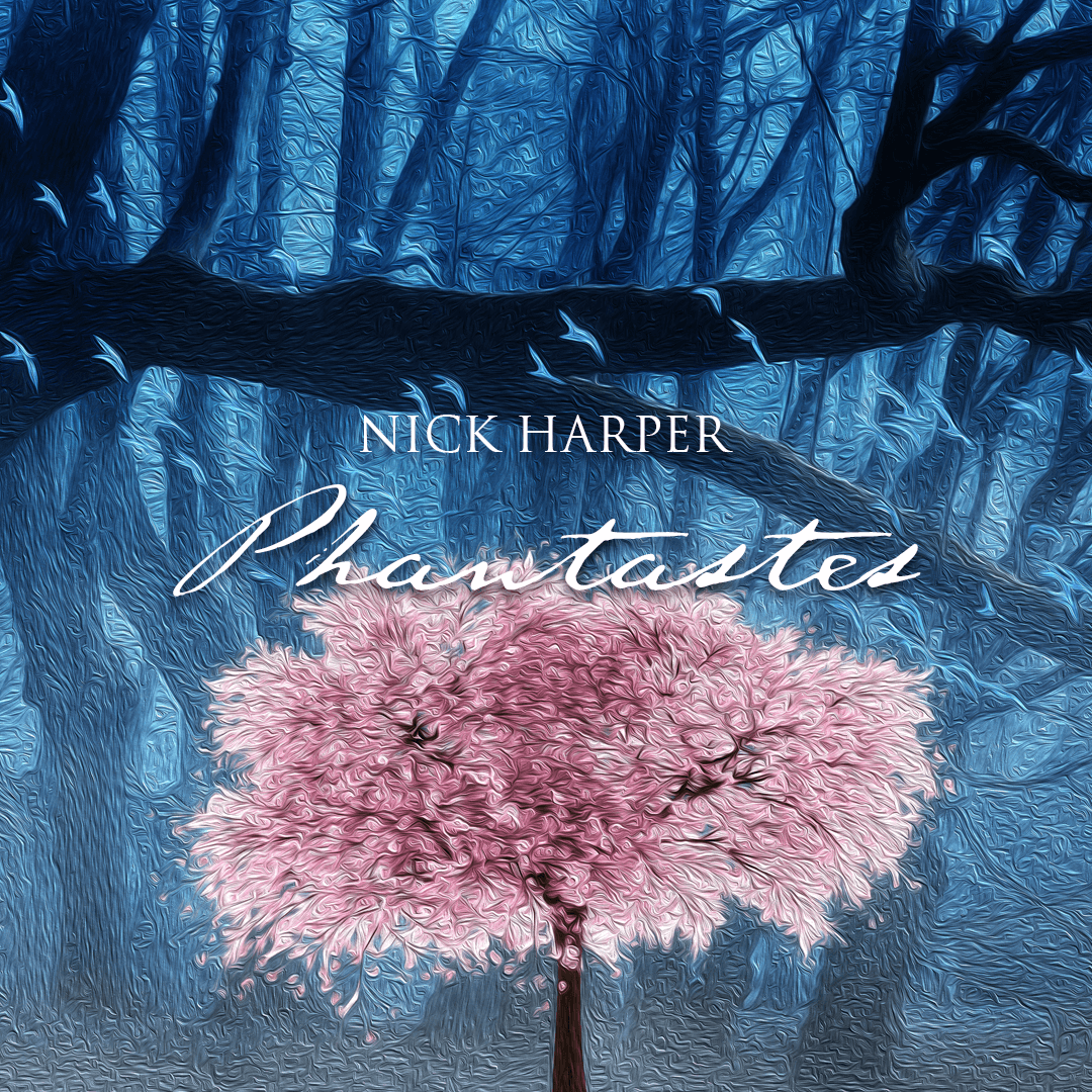
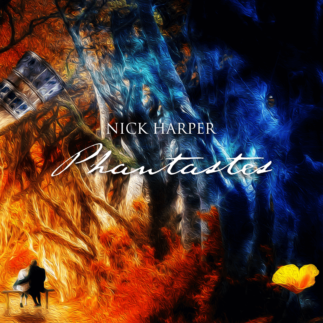
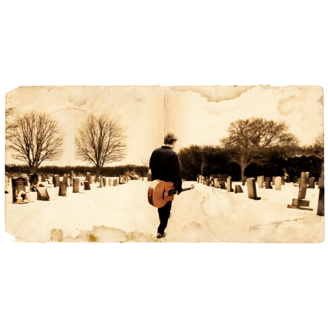
Nick Harper : Phantastes : 2021
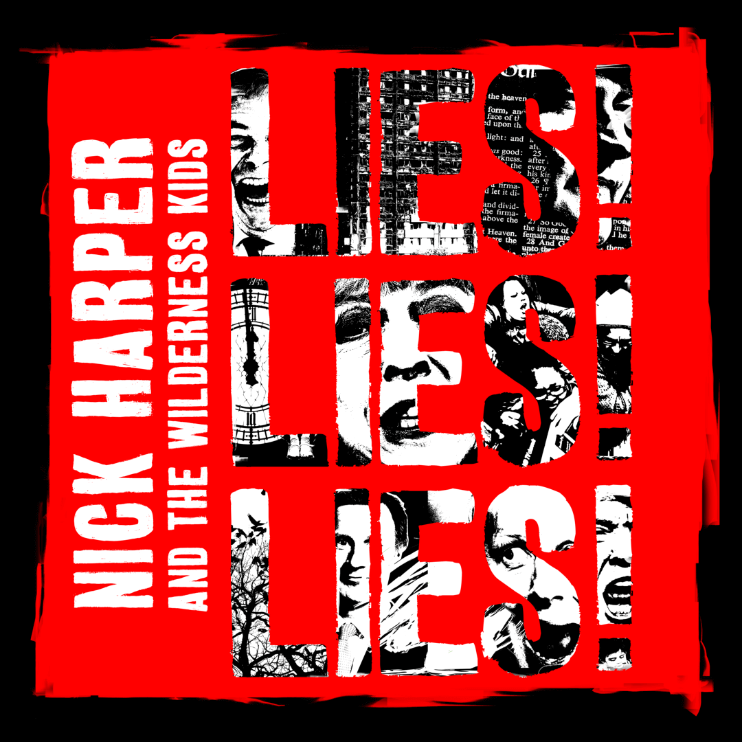
Nick Harper : LIES! LIES! LIES! : 2017
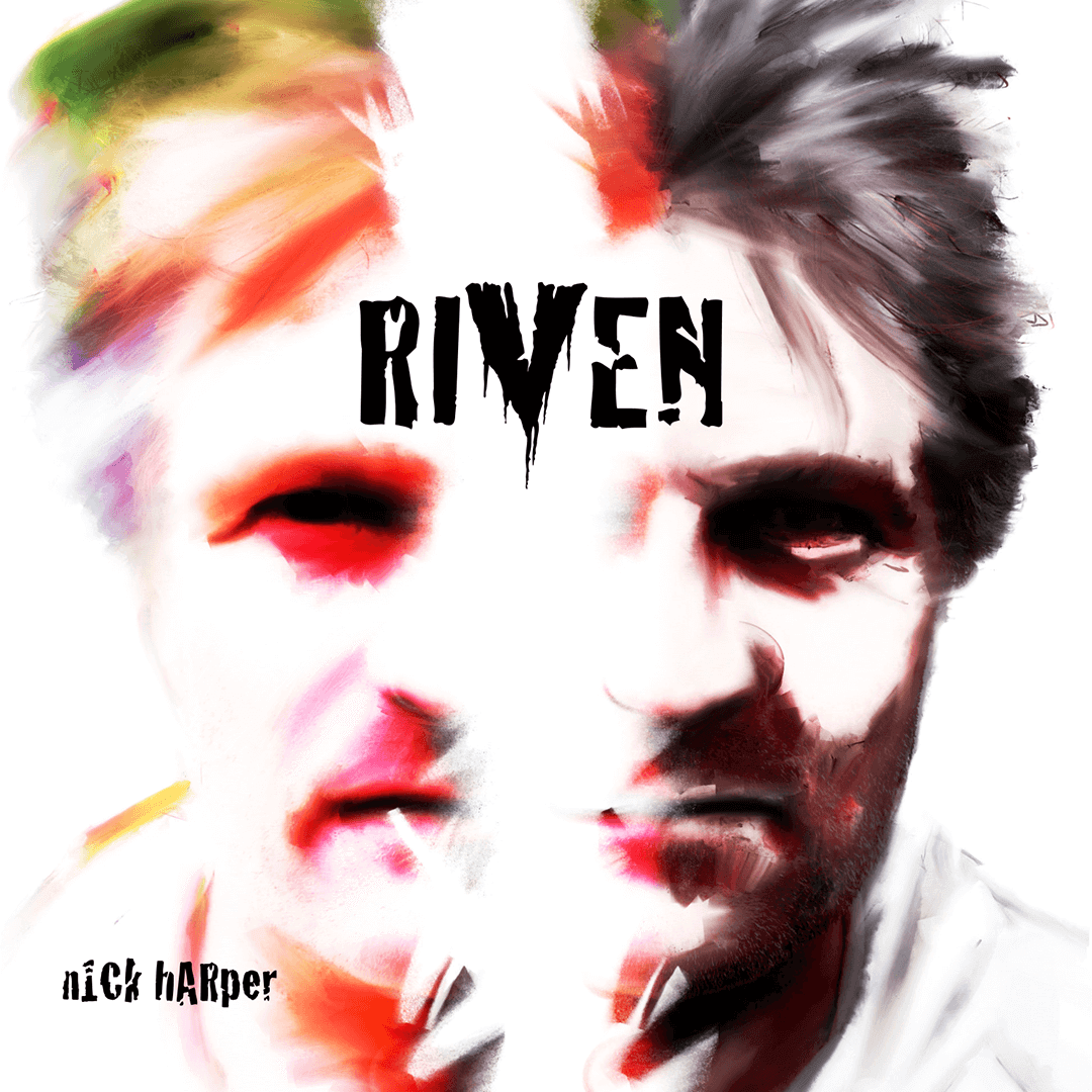
Nick Harper : Riven : 2013
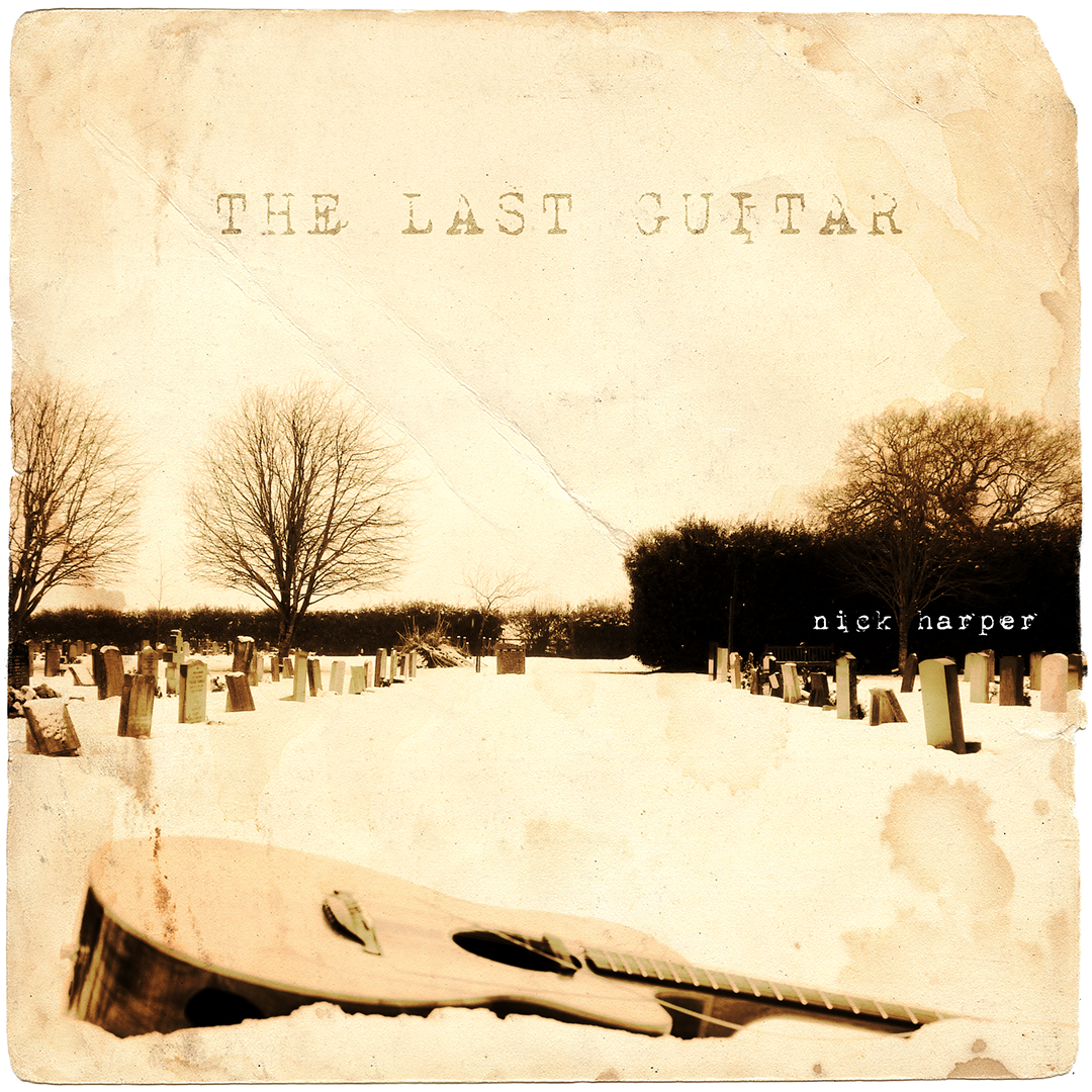
Nick Harper : The Last Guitar : 2010
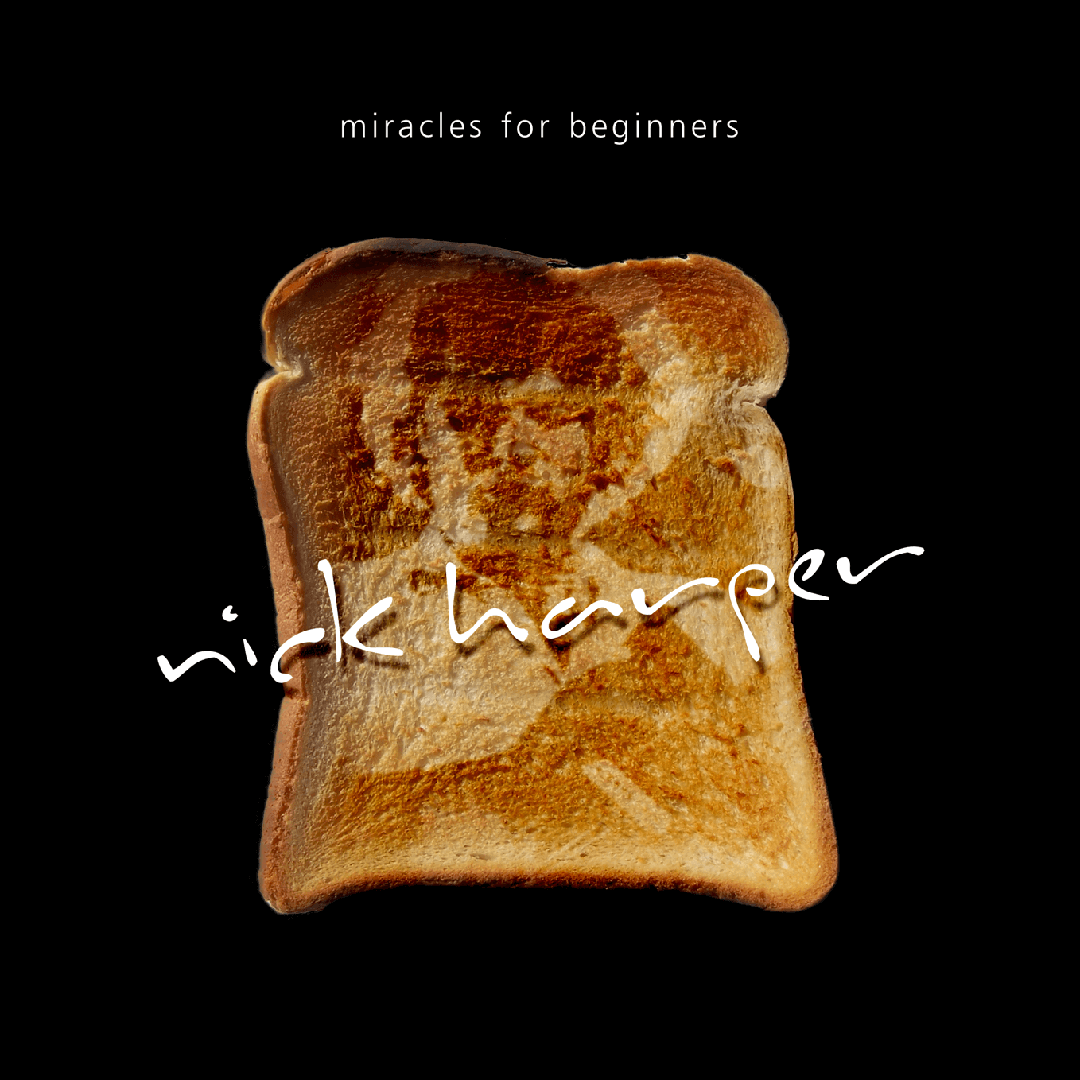
Nick Harper : Miracles For Beginners : 2007
Nick Harper : Treasure Island : 2005
Nick Harper : Bloodsongs : 2004
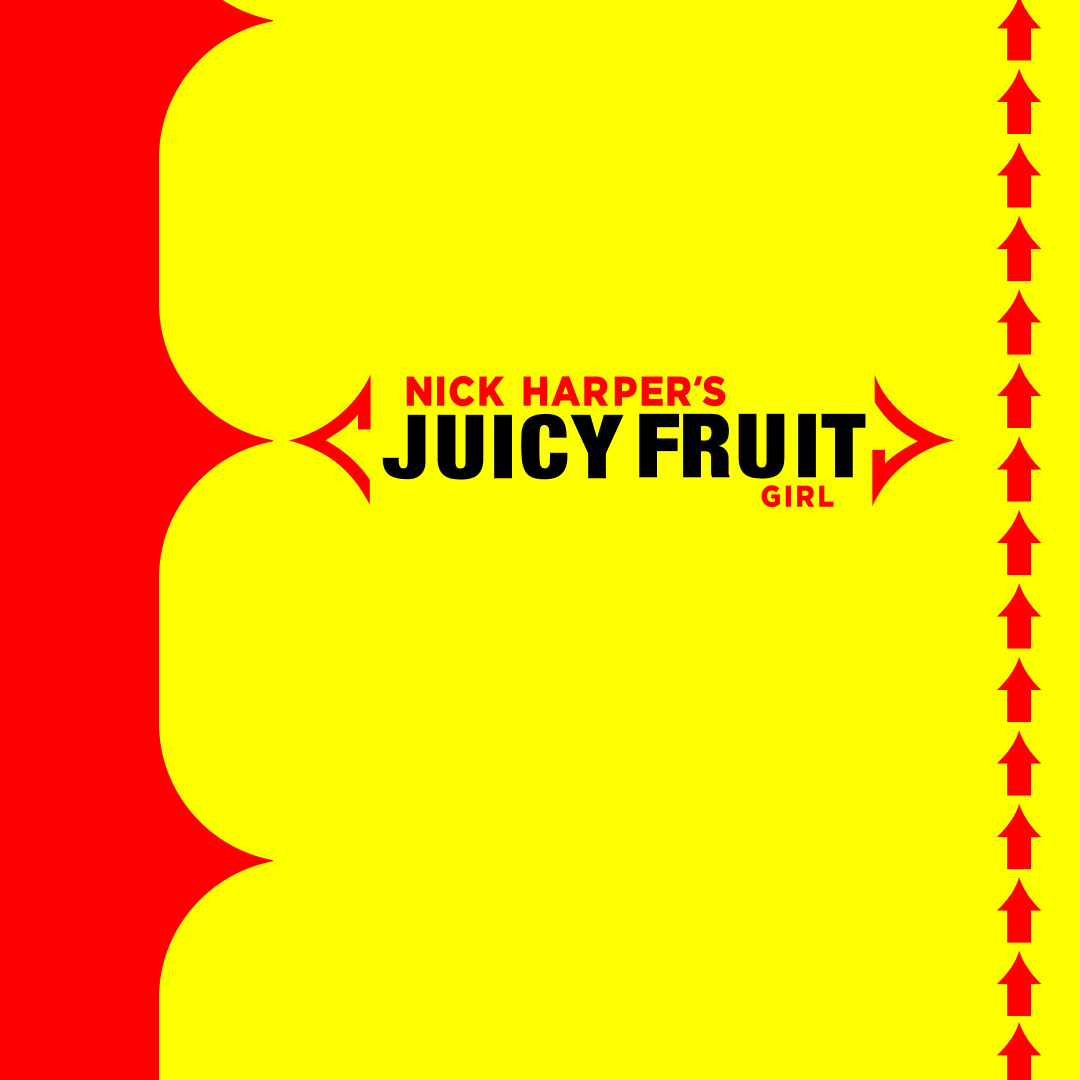
Nick Harper : Juicy Fruit Girl : 2013
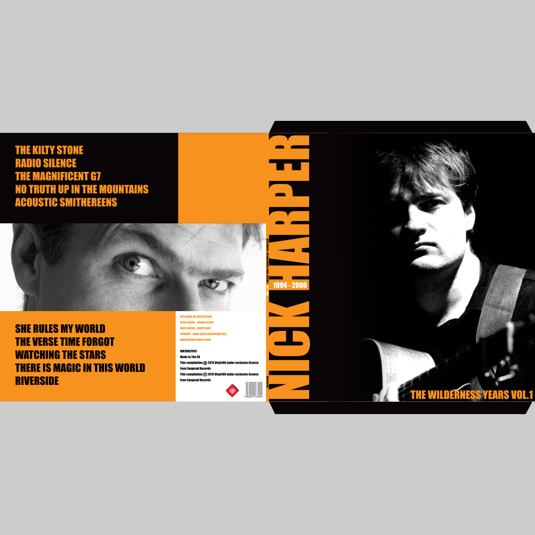
Nick Harper : The Wilderness Years Volume 1 : 2016
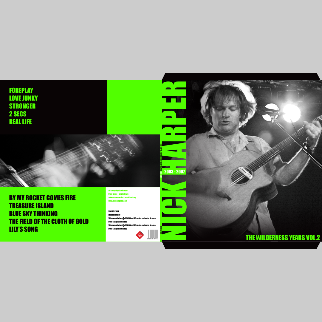
Nick Harper : The Wilderness Years Volume 2 : 2016
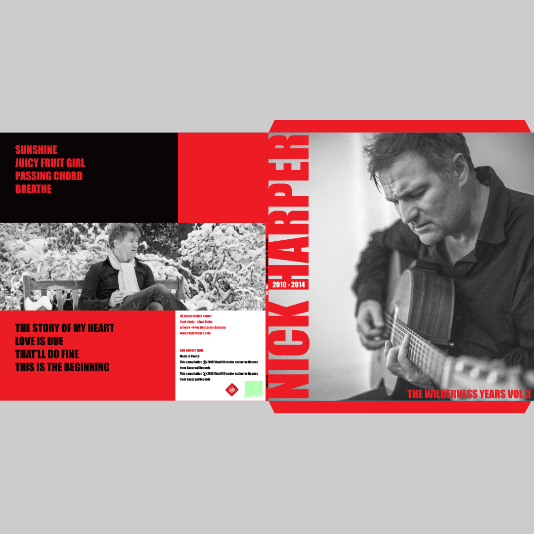
Nick Harper : The Wilderness Years Volume 3 : 2016
Nick Harper : Earth Day Blue : 2024 : Back Cover
Nick Harper : Tempus Fugitive : 2023 : Internal Pic
Nick Harper : Tempus Fugitive : 2023 : Internal Pic
Nick Harper : Phantastes Inner Art Panel
Nick Harper : Phantastes Inner Art Panel
Nick Harper : Phantastes Inner Art Panel
Nick Harper : Phantastes Inner Art Panel
The Last Guitar
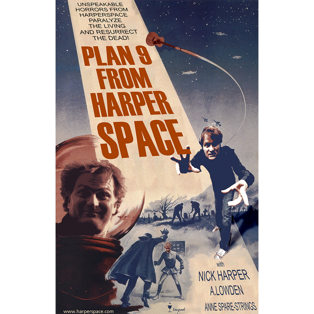
Nick Harper : Plan 9 From Harperspace T-shirt
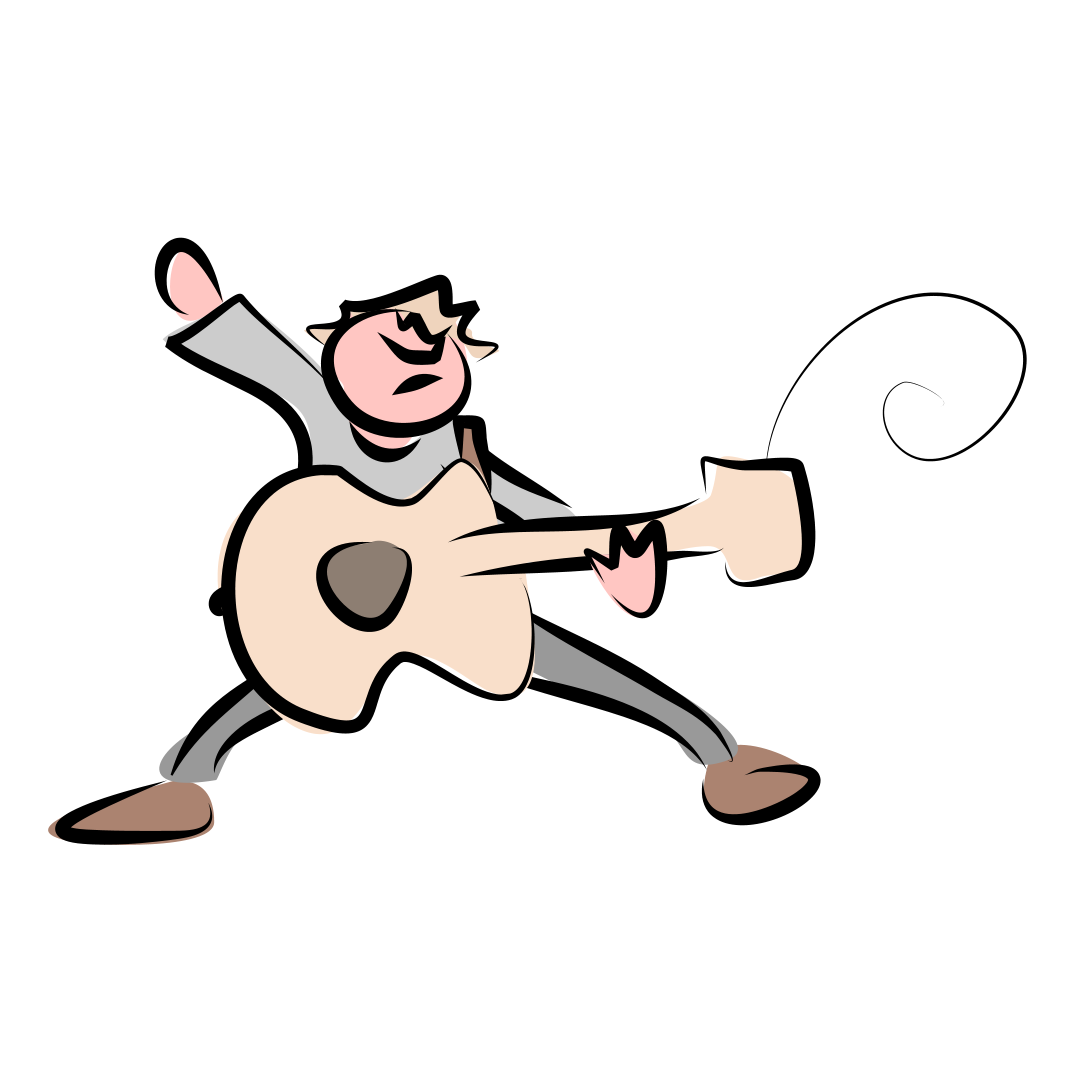
Nick Harper: The 27-second Scribble
As the title suggests, this section is just full of random stuff; one-off projects, pointless Photoshop composites, painstaking recreations of poor-quality images, spoof posters, a bit of pen and ink, some basic 3D work; ideas that have come to me in the shower, whilst doing the dishes and whilst on poo patrol in the garden (we have a dog!)
I included this section to show that design isn’t just a job to me; it’s not something I do solely for other people or solely for payment. I do stuff like this because I want to, not because I have to, and that love of doing what I do will always colour anything I’m asked to do professionally, no matter how dull or boring the project might be!
My contribution to the Queen's Platinum Jubilee celebrations
Poster design for a play
Brochure inserts for nTouch
Bernard Cornwell - Sharpe's Bin.
Brochure design for the Long Barrow at All Cannings.
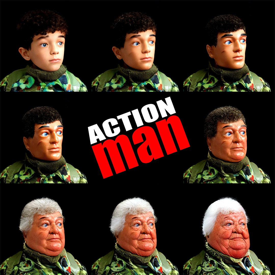
Fun with FaceApp and Photoshop : Action Man (Nan?)
Stiff Little Fingers HANX! album spoof
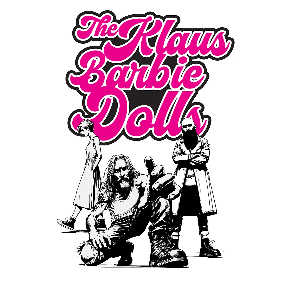
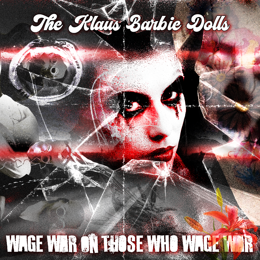
Klaus Barbie Dolls logo and illustration
Nick Harper aside, I’ve done CD and Vinyl artwork for other people too over the years. Some have been my own designs and others have had to adhere to exisiting ideas or very firm art direction from the client. Either way, they all involve meticulous planning and millimetre precision when adhering to various blank templates for the cover, the inside gatefold, the on-body artwork etc, as well a good working knowledge of print stuff: bleed margins, bitmap dpi, printers’ marks, pdf export settings and the like.
Equally as important is a good, sharp eye when it comes to spelling and grammar, especially for print projects. For instance, if I were to spell sentecne wrong in this sentence, I could easily pop back into the WordPress backend at a later date and change it. Make that mistake (or not spot it) during a print project and that typo is there forever; a glaring and embarrassing reminder that you don’t just copy and paste from a client’s website-content.doc, you proof-read it first!
Cephid - Sparks in the Darkness
Artwork for The Klaus Barbie Doll's album Wage War On Those Who Wage War
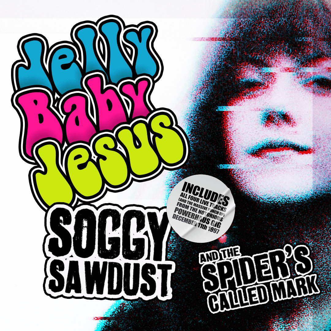
Jelly Baby Jesus - Soggy Sawdust and the Spider's Called Mark CD Cover
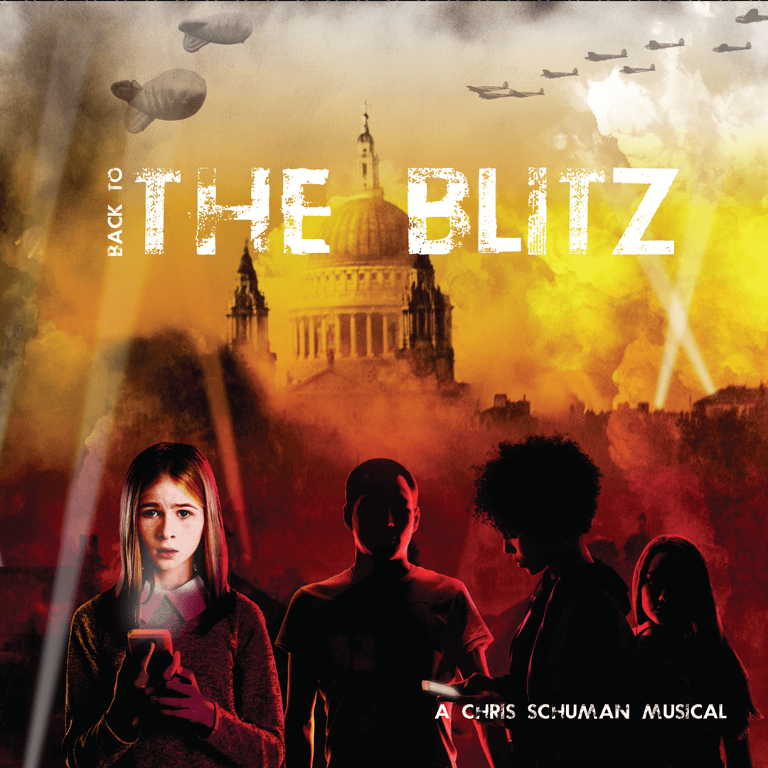
Back To The Blitz - Chris Schuman
Doris Day Care - Marmalade Fusillade
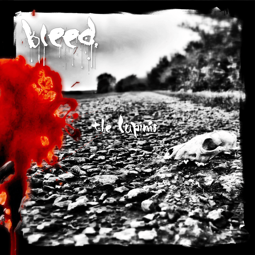
The Lupinis - Bleed
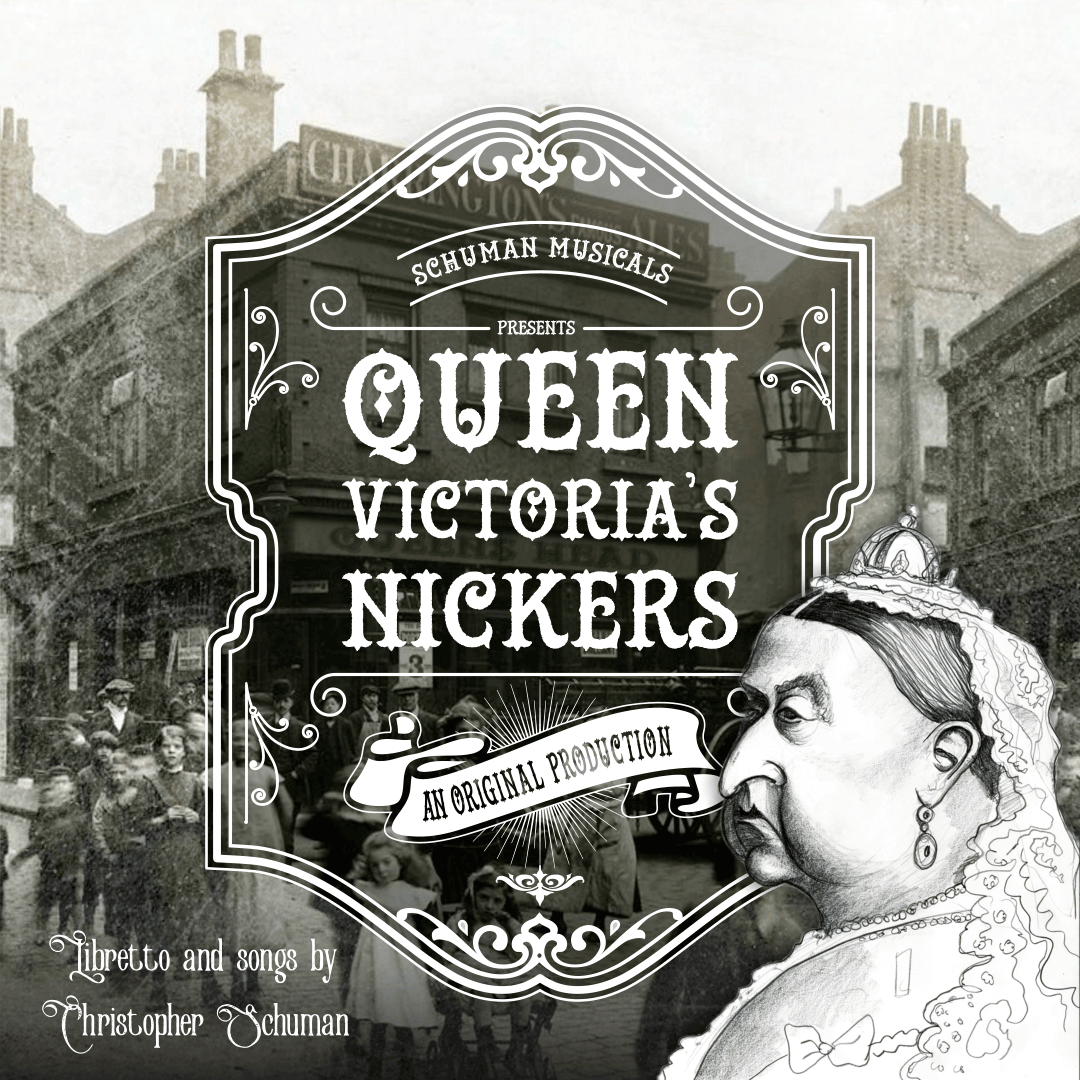
Queen Victoria's Nickers (2018) - Chris Schuman
Queen Victoria's Nickers (2025) - Chris Schuman
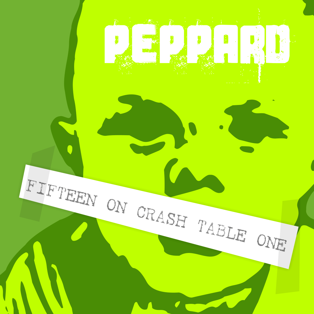
Peppard: Fifteen on Crash Table One
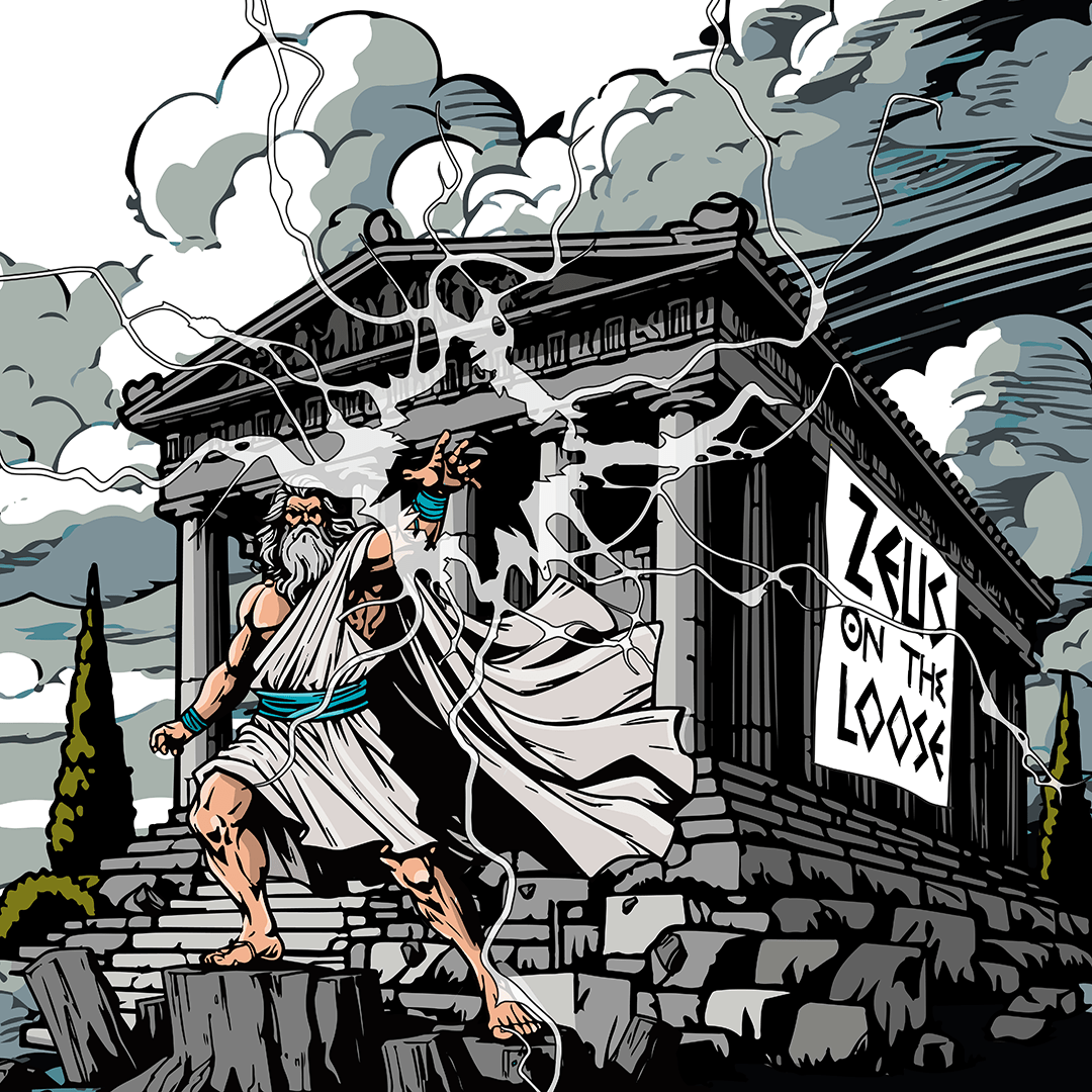
Zeus on the Loose - Chris Schuman
Minotaur : A Chris Schuman Musicals character
Eurydice : A Chris Schuman Musicals character
Most of this section is pretty uninspiring, as most of it was done for a marketing company whose client base consisted of some of the dullest people, sectors and institutions imaginable.
There’s only so much pizazz, energy, flair and excitement you can inject into the topics of invoice finance or pension plans, especially when the post content itself is dry and humourless and the corporate guidelines document is set in stone with absolutely no wriggle room at all. But I’ve included some of these more dismal examples only to show that I can make the most of a rubbish hand of cards if needs be 🙂
I must point out that when it comes to social media posts, I’m not a social media expert. I don’t know the ins and outs of Sprout Social, Hubspot, Meltwater et al. and I don’t do the analytics or the reporting, I don’t master the campaigns and I don’t write the content (although I do proof-read it to the nth degree) I just do the pretty bits! I take the brief and guidelines and come up with something compatible, fitting and – hopefully – a little bit different that tells the story visually and with impact.
I’ve also included some of the more exciting and humorous ones 🙂
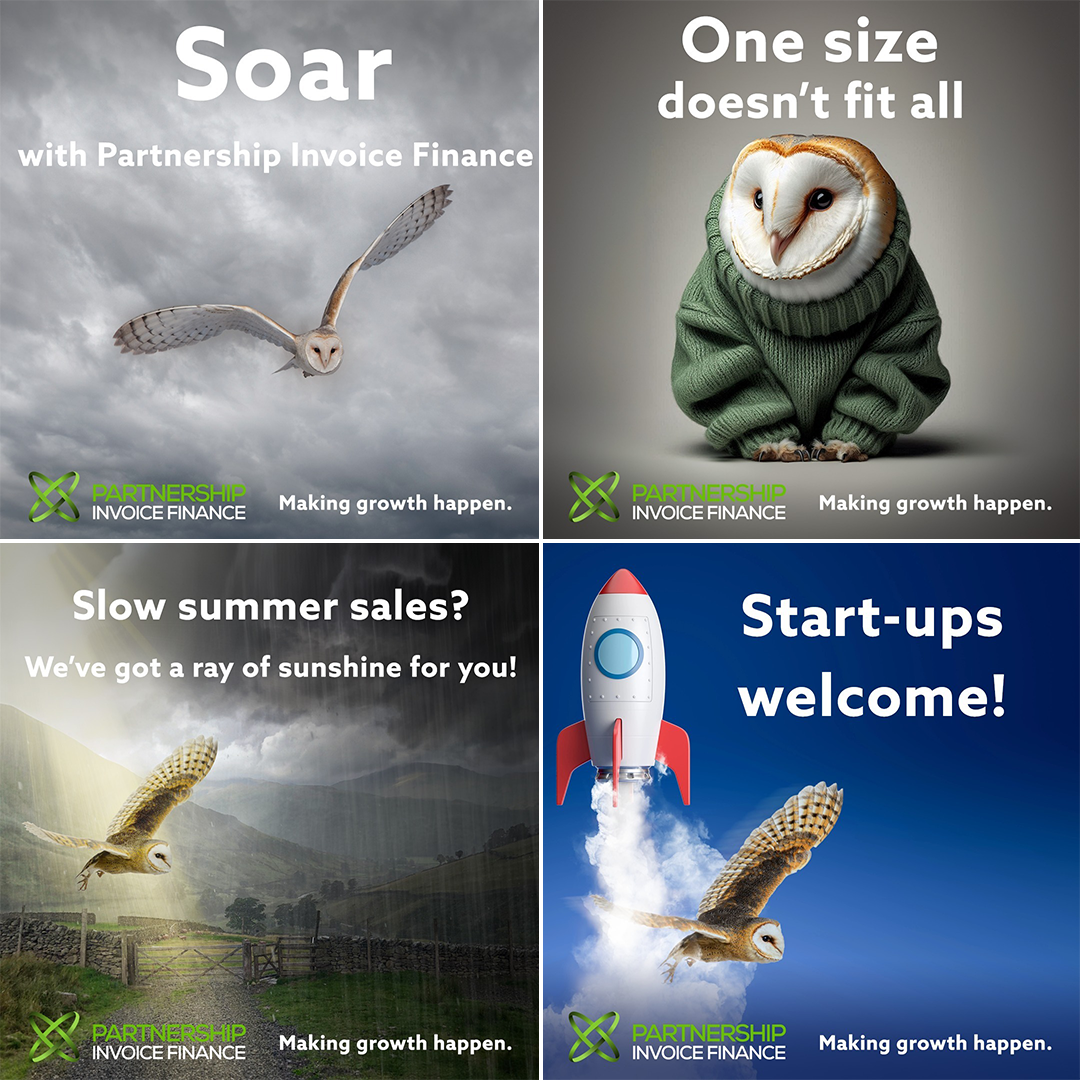
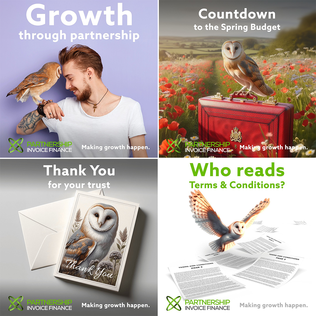
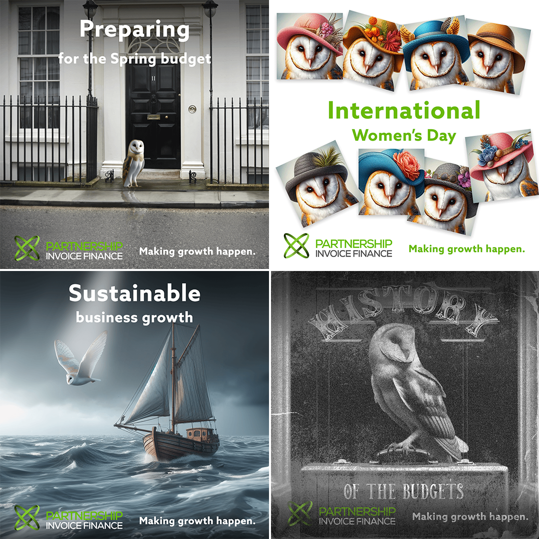
Social media posts for Partnership Invoice Finance
Social media posts for Partnership Invoice Finance
Social media posts for Partnership Invoice Finance
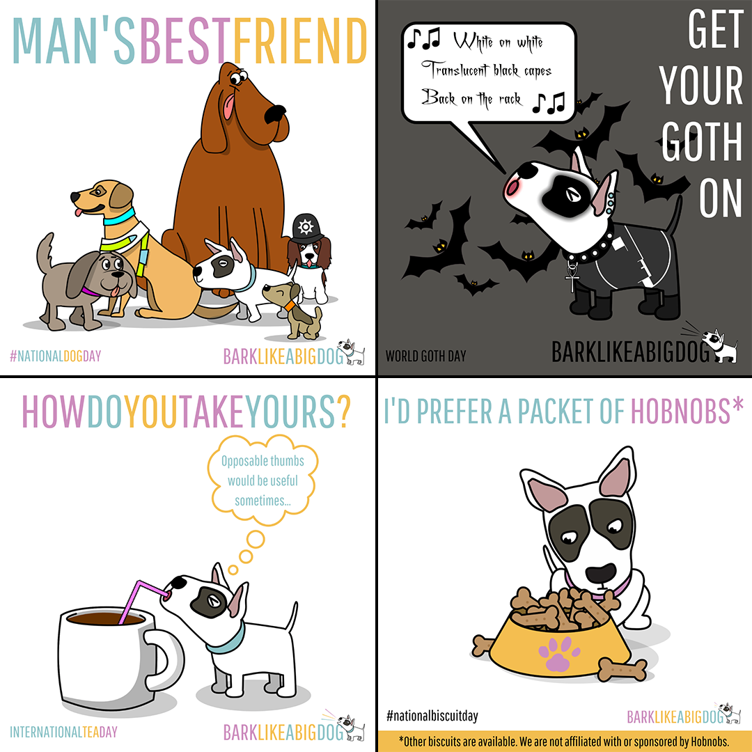
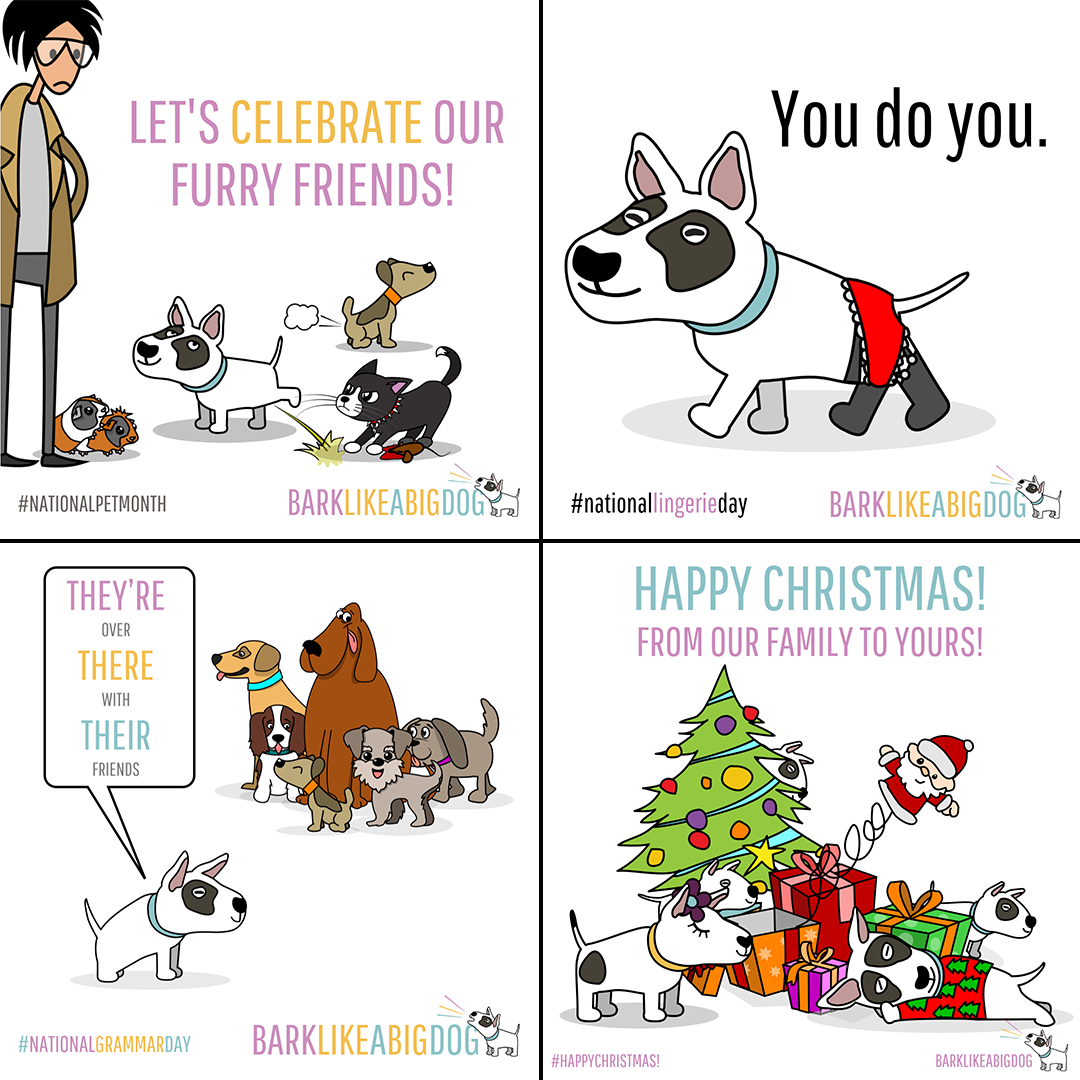
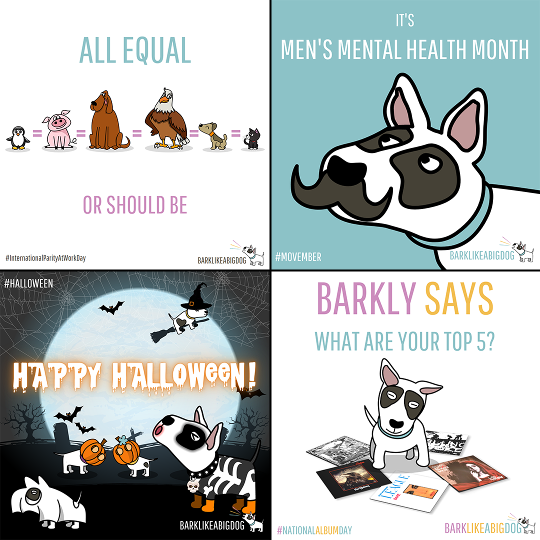
Social media posts for Bark Like a Big Dog
Social media posts for Bark Like a Big Dog
Social media posts for Bark Like a Big Dog
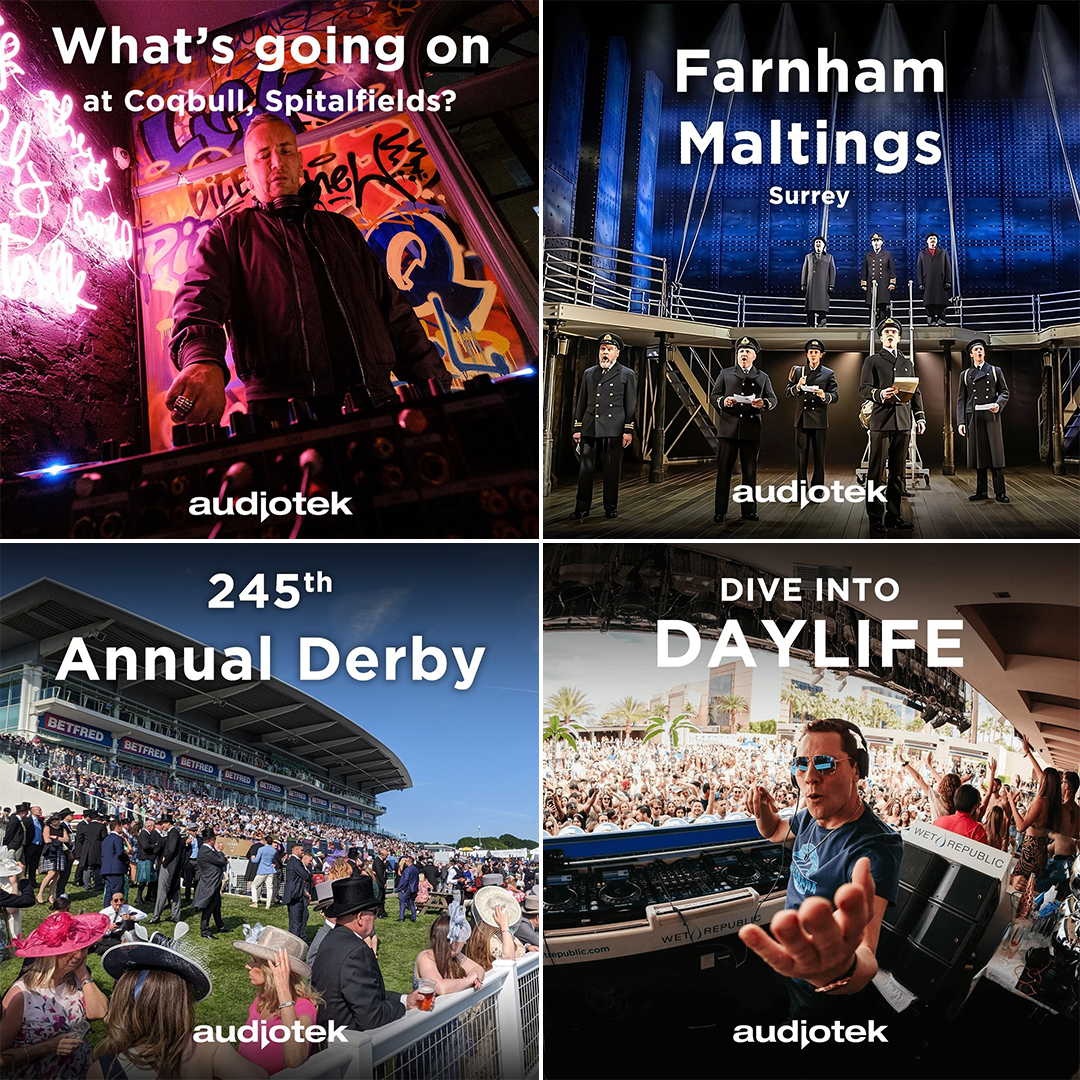
Social media posts for Audiotek
Social media posts for Audiotek
Social media posts for Invoice 4 Business
Social media posts for A1 Cleaning
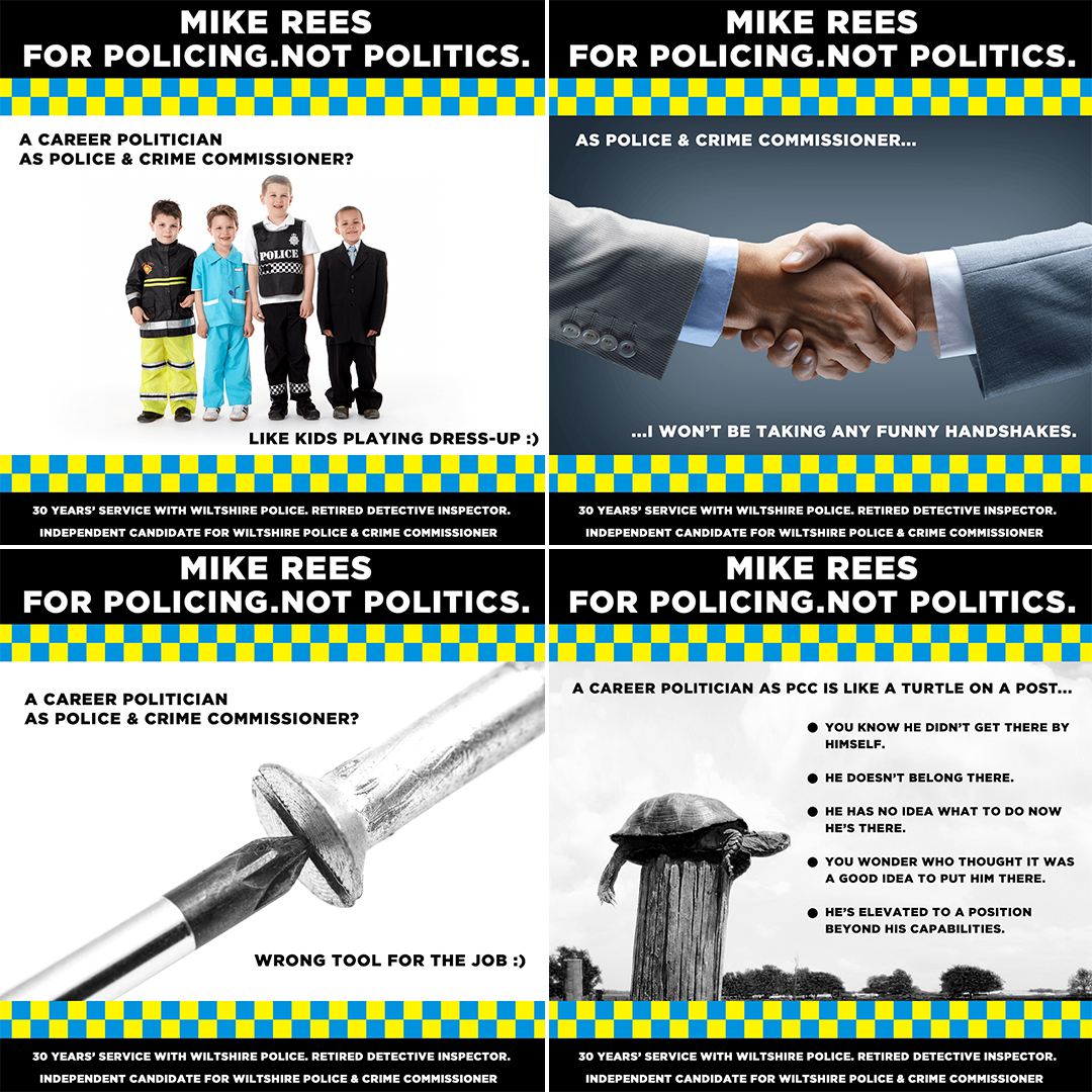
Social media posts for PCC Candidate Mike Rees (He should've won)
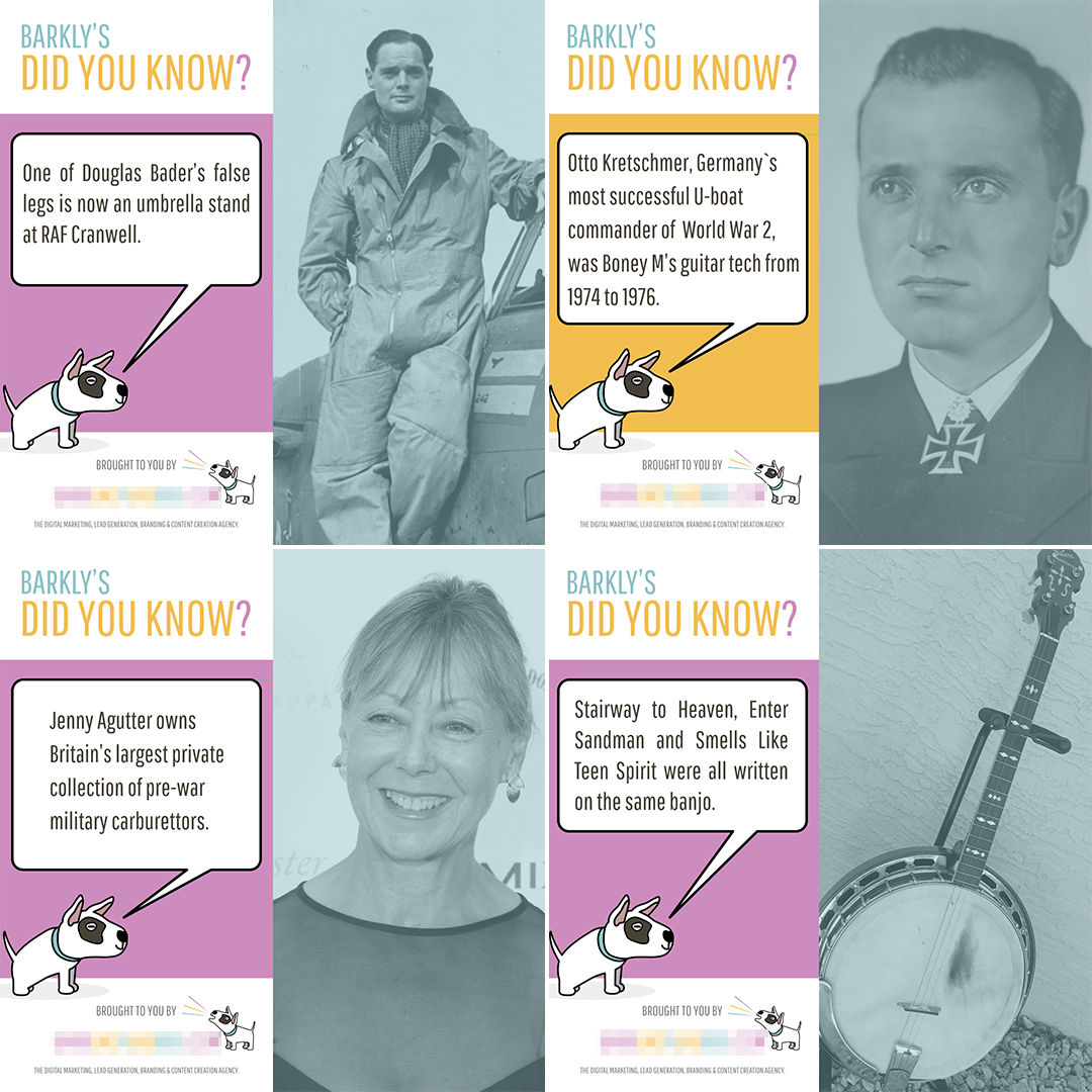
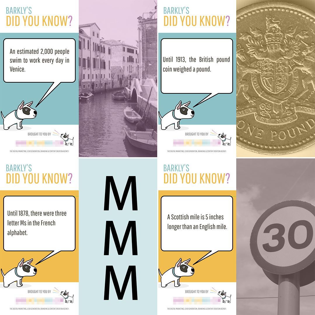
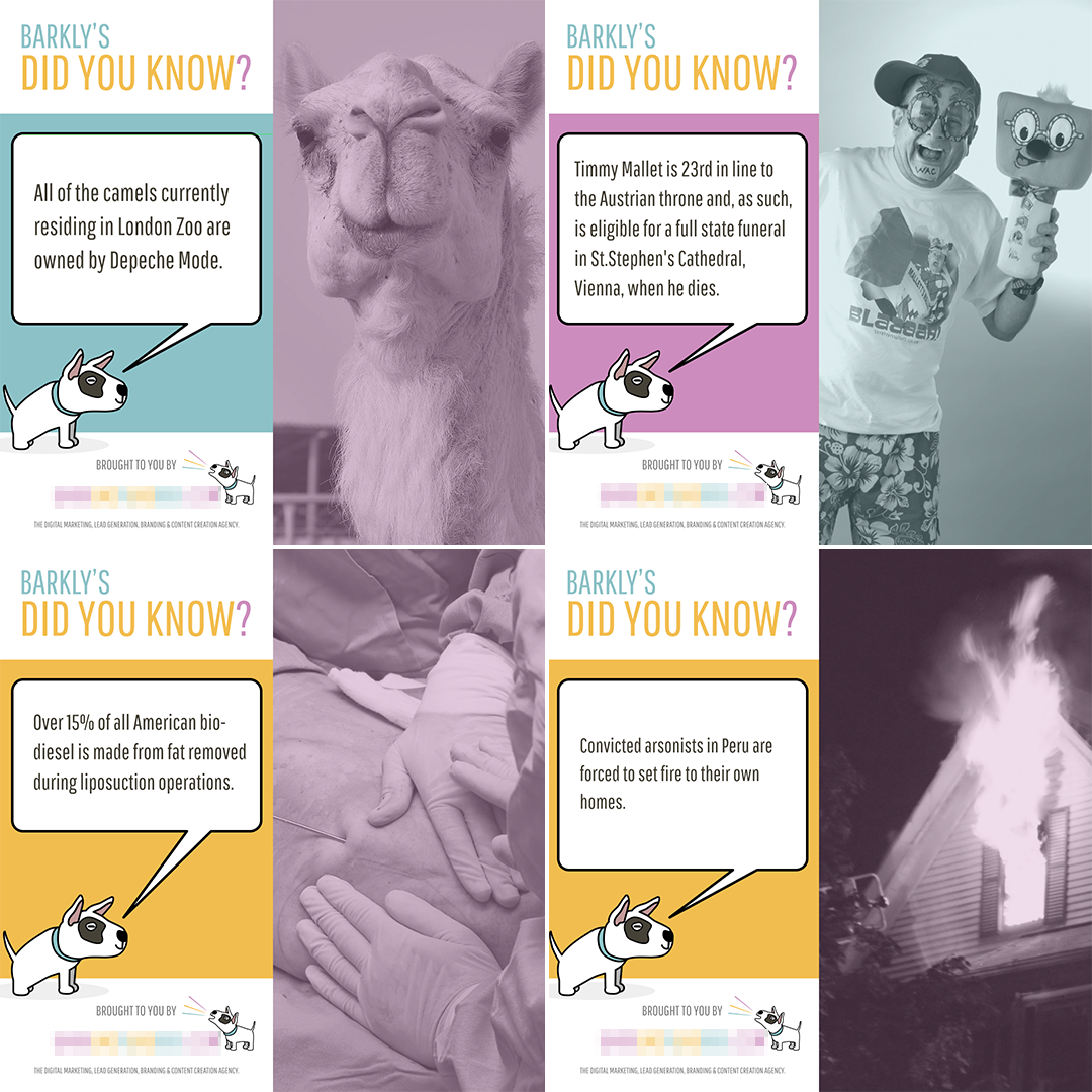
Fun posts for Bark Like a Big Dog
Fun posts for Bark Like a Big Dog
Fun posts for Bark Like a Big Dog
Nick Harper - Earth Day Blue Social Media Post
Nick Harper - Tempus Fugitive Social Media Post
Nick Harper - Tempus Fugitive Social Media Post
Nick Harper - Tempus Fugitive Social Media Post
Nick Harper - Tempus Fugitive Social Media Post
Way back in the 1980s – inspired as I was by various artists such as Brian Bolland, Cam Kennedy, Steve Dillon, Carlos Ezquerra and Dave Gibbons (who all drew for 2000 AD) – I started dabbling in pen and ink comic art. Having not studied art at school, I was a bit of a late bloomer and my early attempts at emulating the masters were rather poor and risible.
However, having a job that – at the time – allowed me to sit in a hut all day doing bugger all whilst looking after an otherwise empty hut (not my actual job description, but Official Secrets Act, tho’) I was able to spend countless hours on my own trying to perfect my art.
Although never as good as the artists I was inspired by, I did improve a lot and – come 1986 or thereabouts – was good enough to contribute my own stuff to a small, underground comic called FADOOOM!
But then life bowled a couple of googlies at me (that’s the English equivalent of a “curved ball” to all you Americans who don’t understand cricket) and the pen and ink stuff took a back seat, before finally getting out of the car and wandering off into the distance some time around 1995.
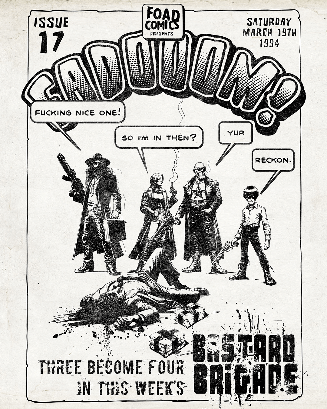
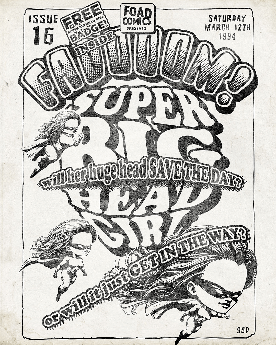
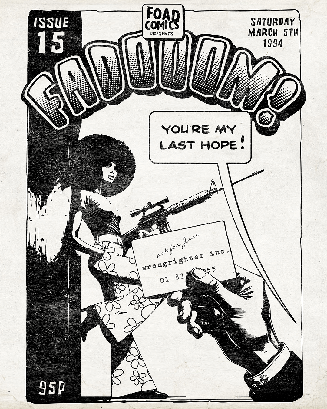
Many years later (well into the next century) I decided to give it a go again, but this time using Adobe Illustrator and Photoshop. And here are some of my later efforts, most of which can be found on my Teemill store as t-shirt and poster designs. The FADOOOM! covers aren’t actual covers from the original comic (most of them don’t exist any longer!) They’re more of a faithful reproduction.
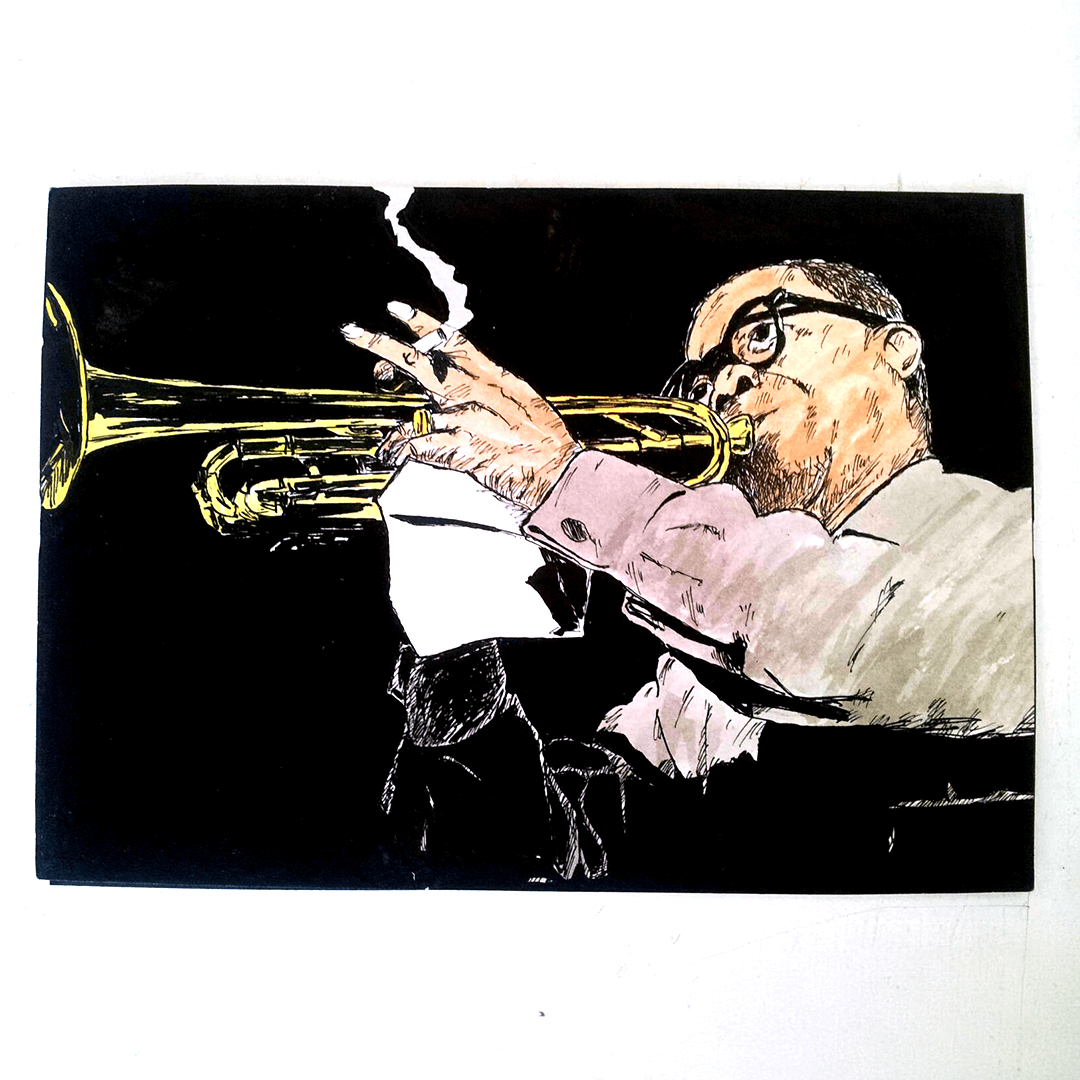
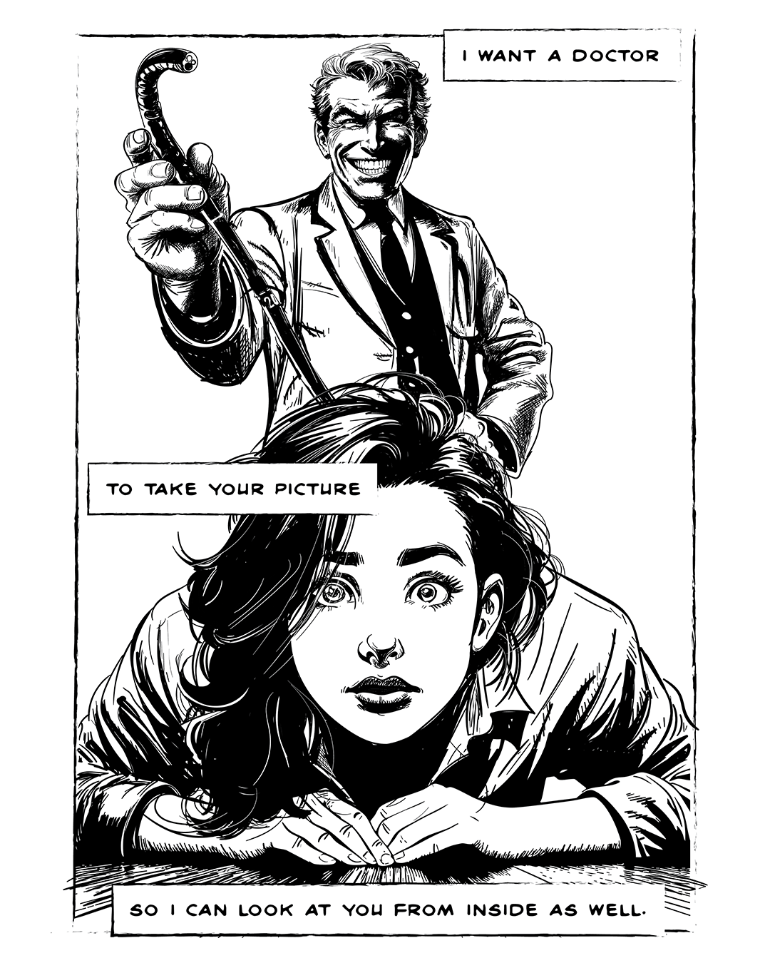
Comic art inspired by song lyrics: Boney M - Ma Baker.
Comic art inspired by song lyrics: Turning Japanese - The Vapors
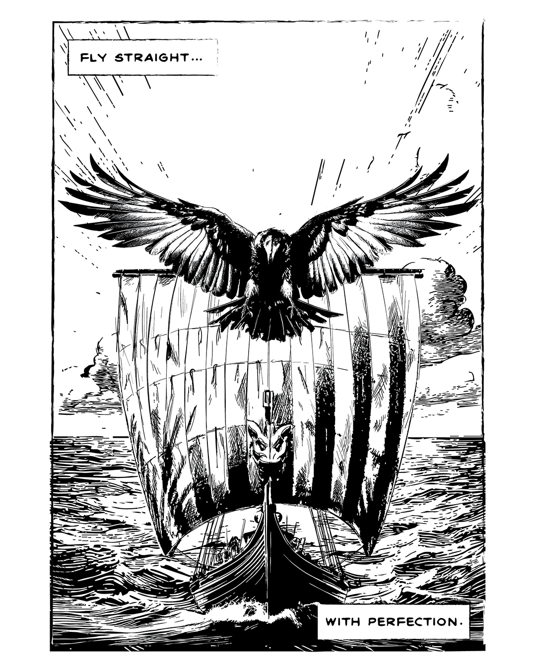
Comic art inspired by song lyrics: The Stranglers - The Raven
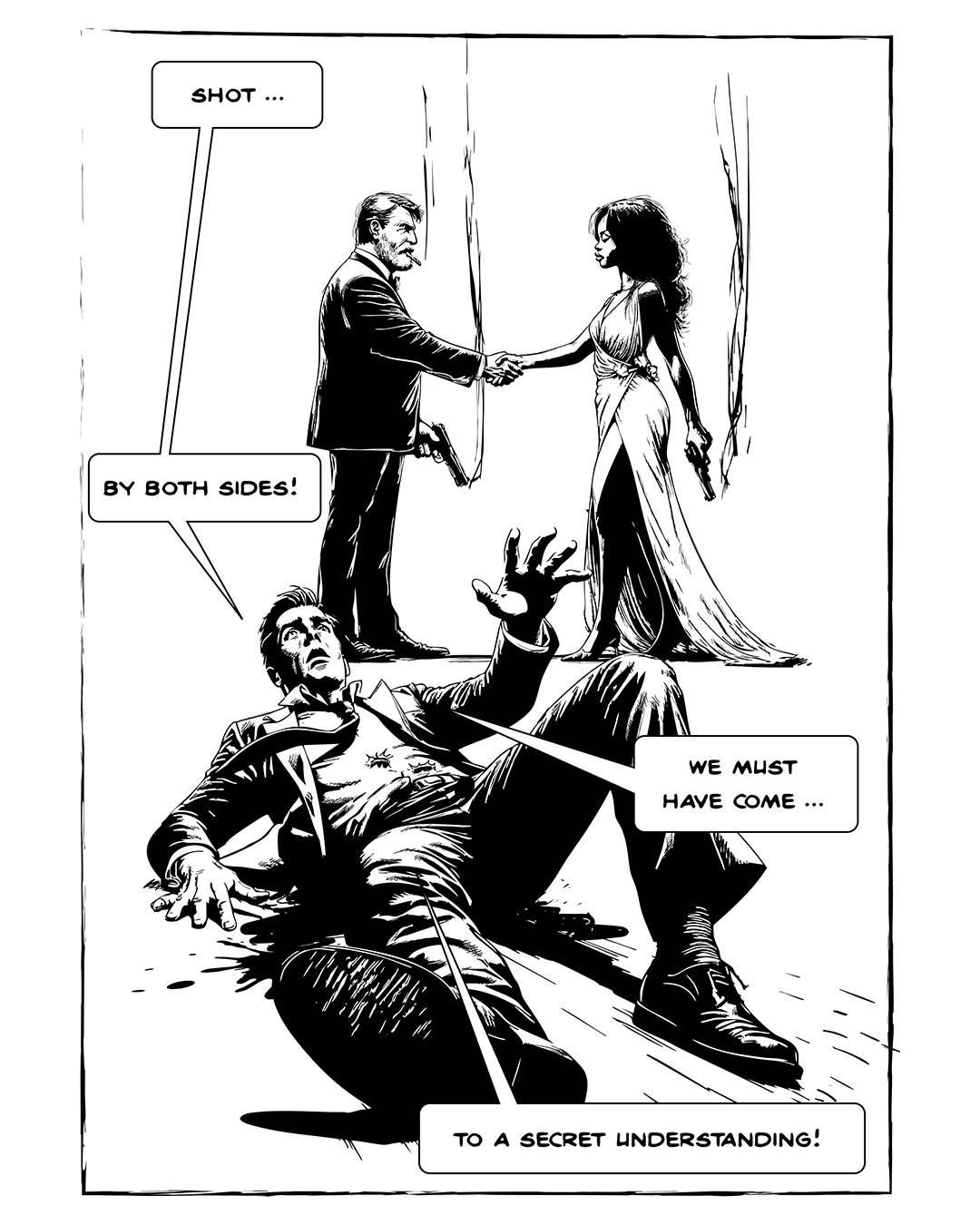
Comic art inspired by song lyrics: Magazine - Shot By Both Sides
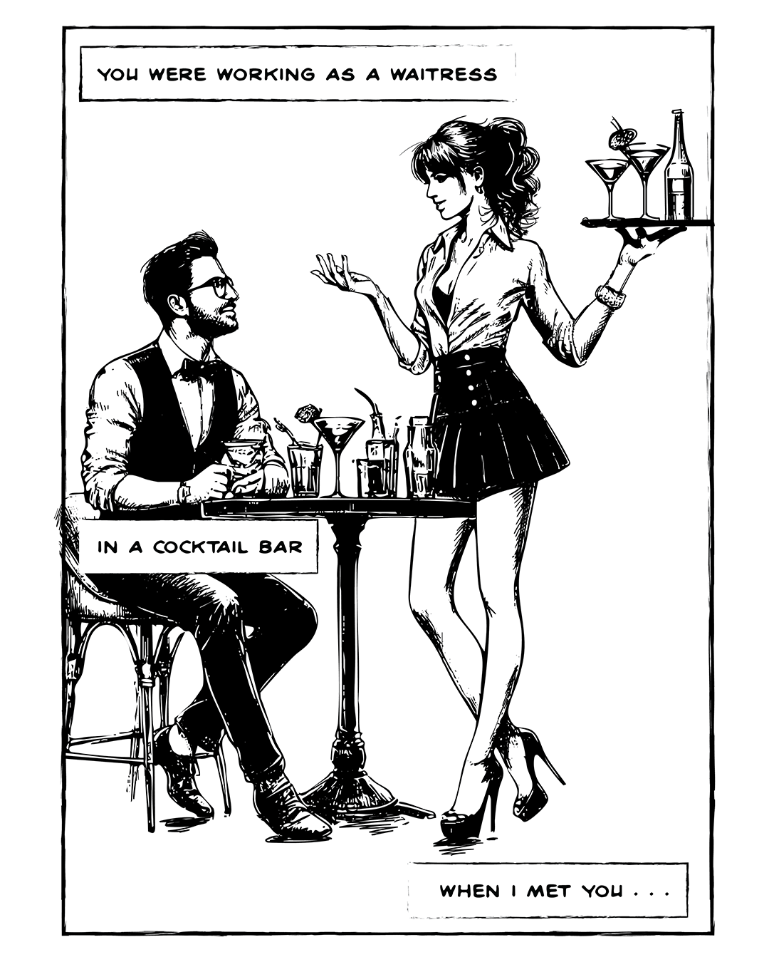
Comic art inspired by song lyrics: The Kinks - Lola
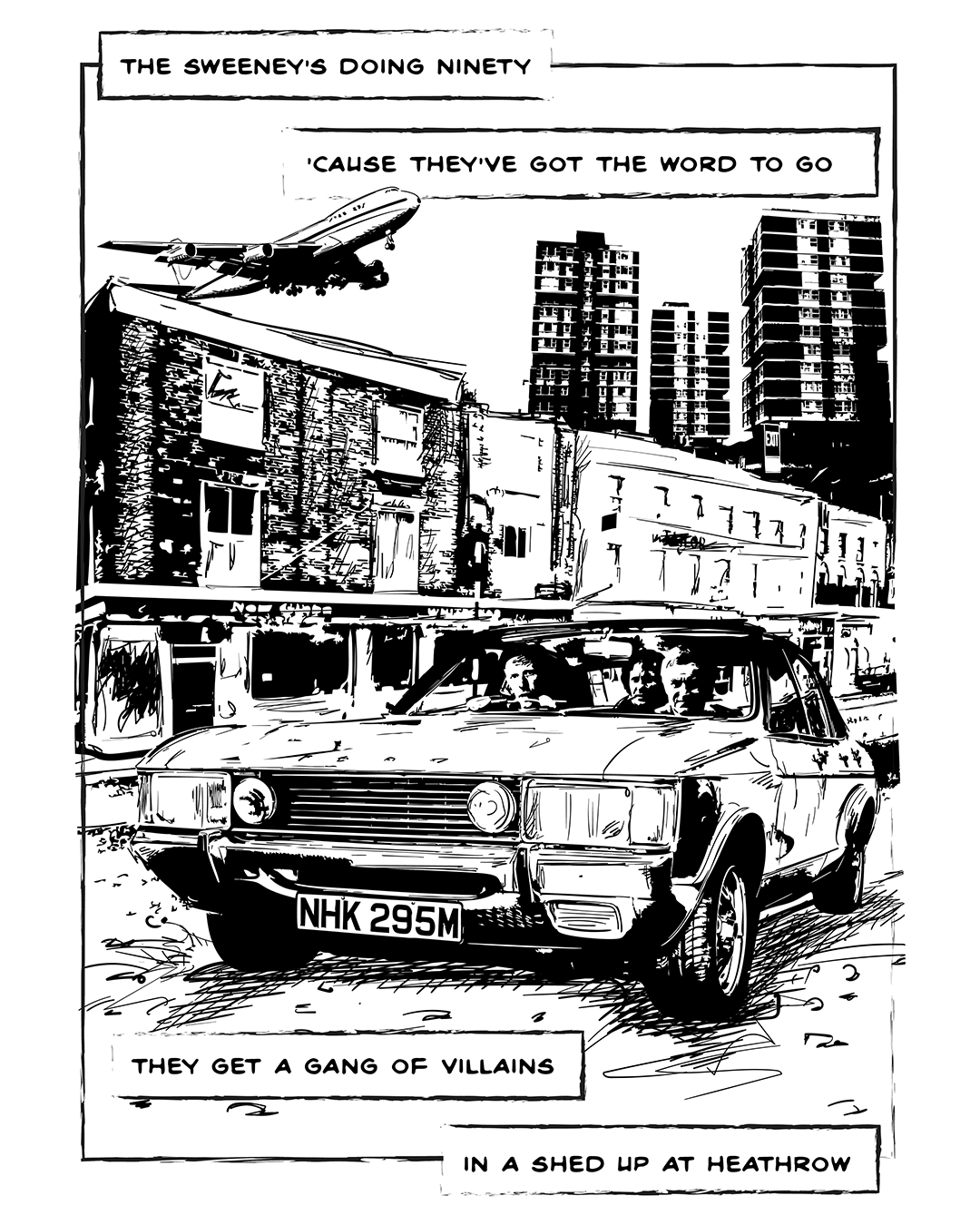
Comic art inspired by song lyrics: Squeeze - Cool For Cats
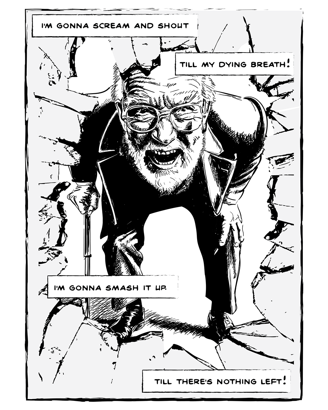
Comic art inspired by song lyrics: The Damned - Smash It Up
Comic art inspired by song lyrics: The Human League - Don't You Want Me
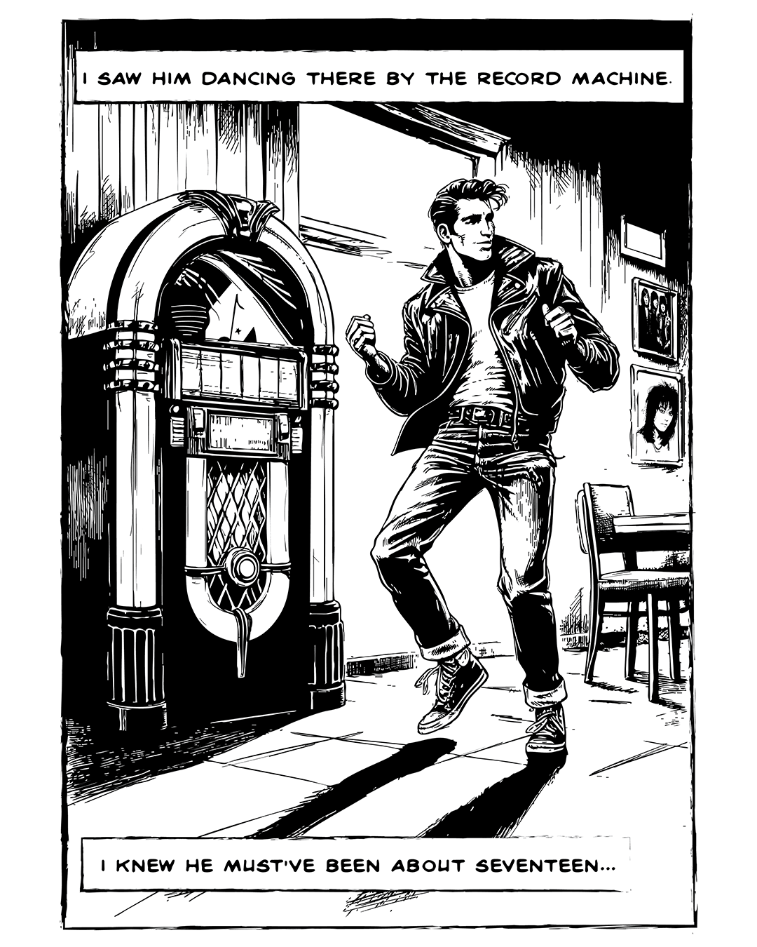
Comic art inspired by song lyrics: I Love Rock 'n' Roll - The Arrows / Joan Jett and The Blackhearts
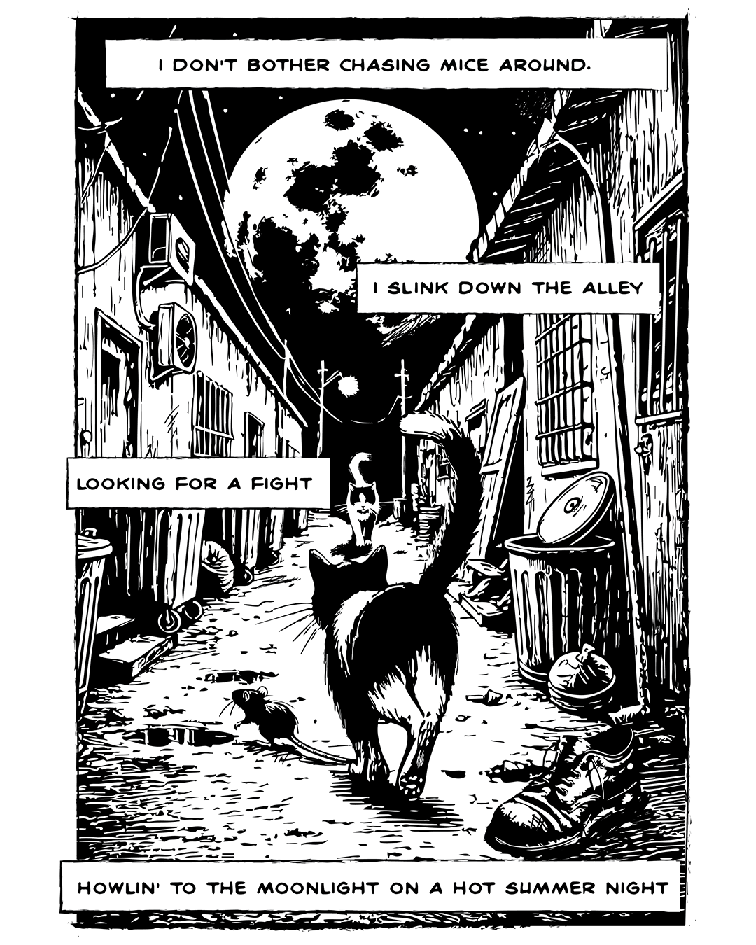
Comic art inspired by song lyrics: Stray Cats - Stray Cat Strut
Comic art inspired by song lyrics: Bronski Beat - Smalltown Boy
Comic art inspired by song lyrics: Tubeway Army - Are Friends Electric?
FADOOOM Issue 17 cover art featuring BASTARD-BRIGADE
FADOOOM Issue 16 cover art featuring SUPER BIG HEAD GIRL
FADOOOM Issue 15 cover art featuring THE WRONG RIGHTER
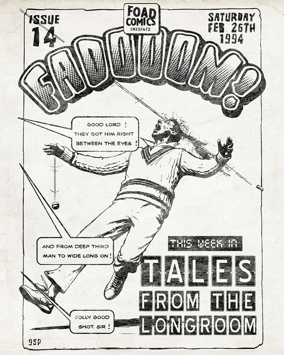
FADOOOM Issue 14 cover art featuring TALES FROM THE LONGROOM
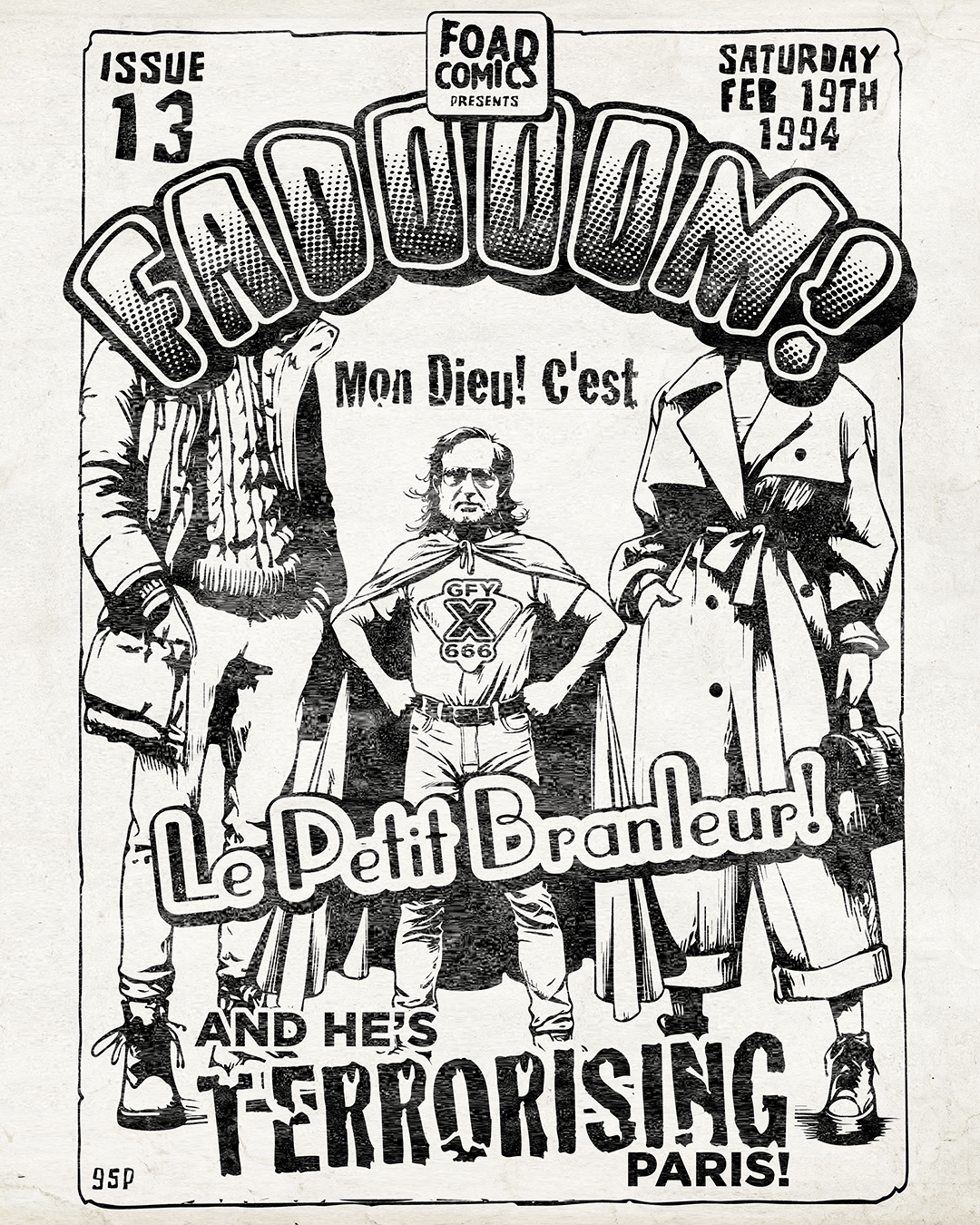
FADOOOM Issue 13 cover art featuring LE PETIT BRANLEUR
FADOOOM Issue 12 cover art featuring SCOTLAND YEAR ZERO
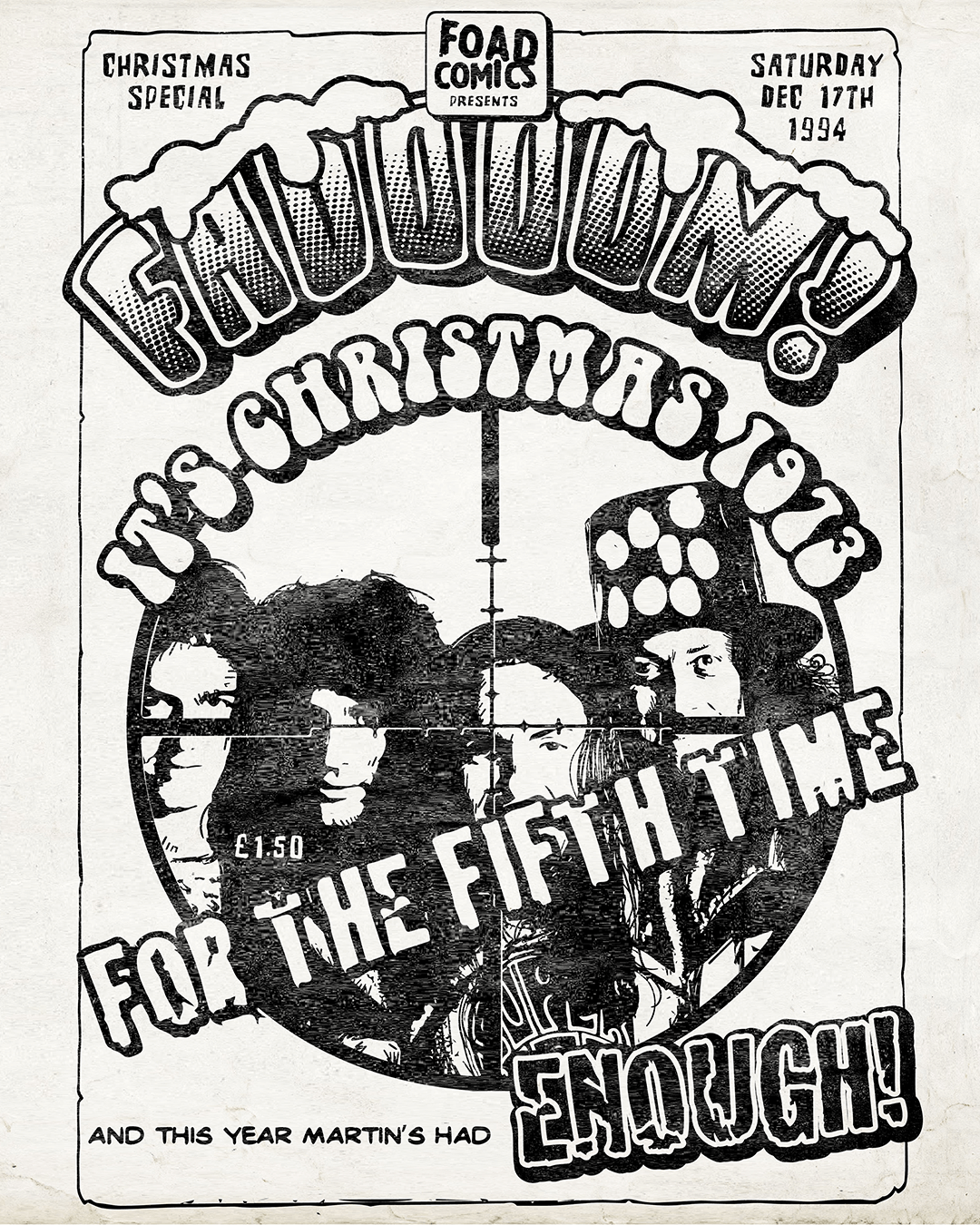
FADOOOM Christmas Special 1994 cover art featuring SLADE